The Fifth Room

As the light begins to change in early spring, the space between house and garden starts to feel different. This piece reflects on outdoor living, atmosphere, and the idea of the garden as another room of the house.


In March, the light changes enough to make you notice the garden again.

The garden is not yet green, but the urge to open the door, even briefly, begins to return. It is the season of almosts: almost warm, almost bright, almost ready. The space between indoors and out begins to feel like the place where renewal starts.

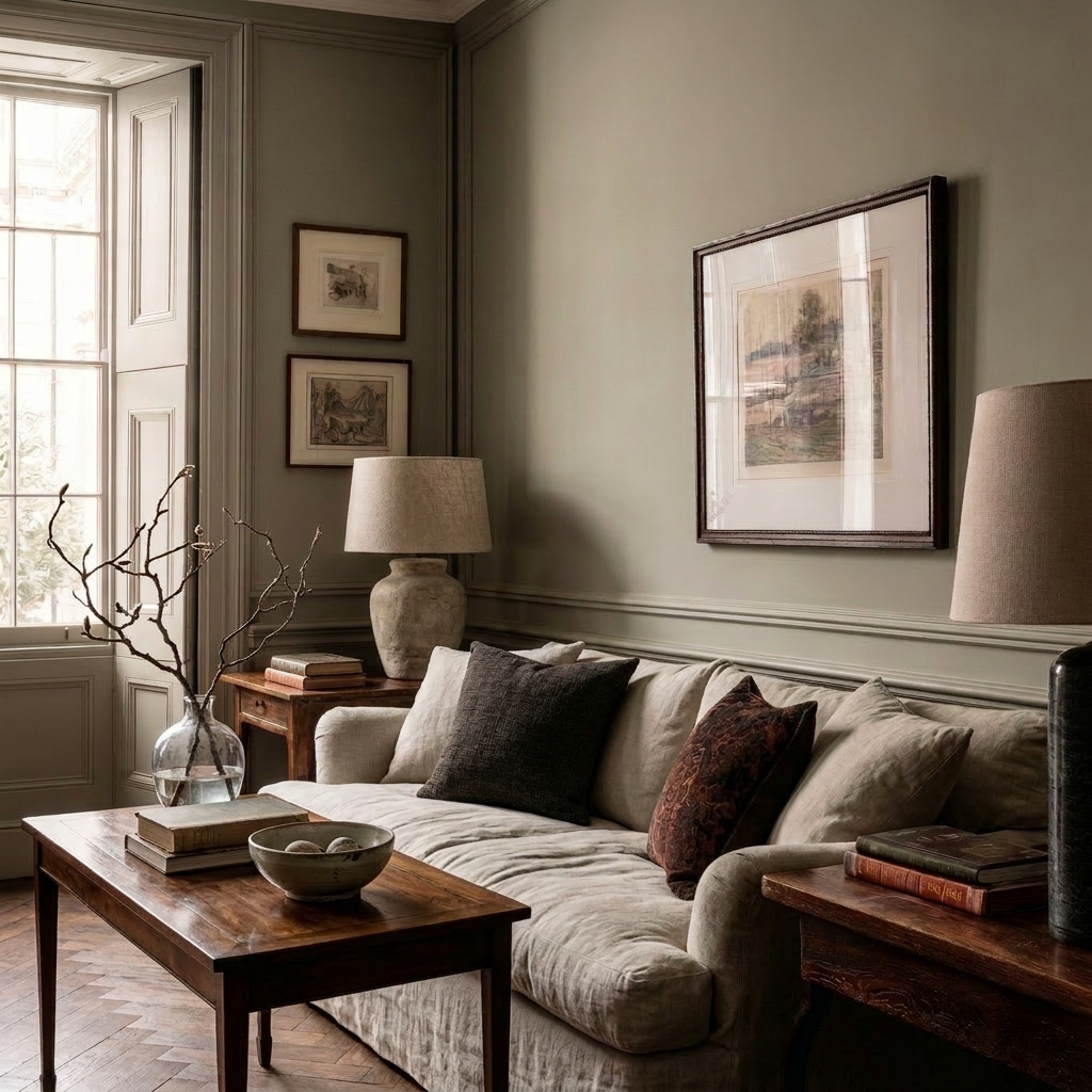
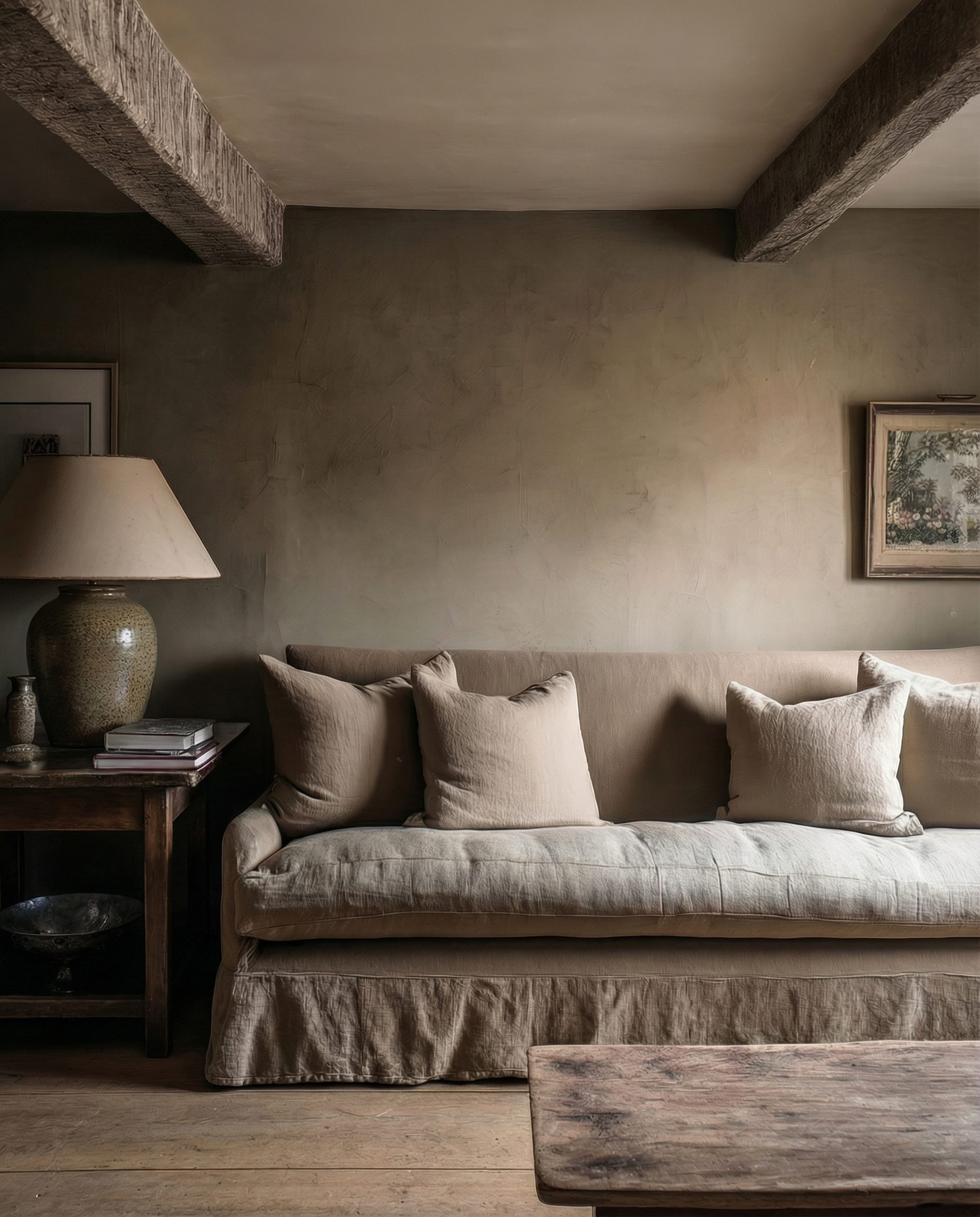
In winter, we build rooms that hold us.
In early spring, we begin to open them.

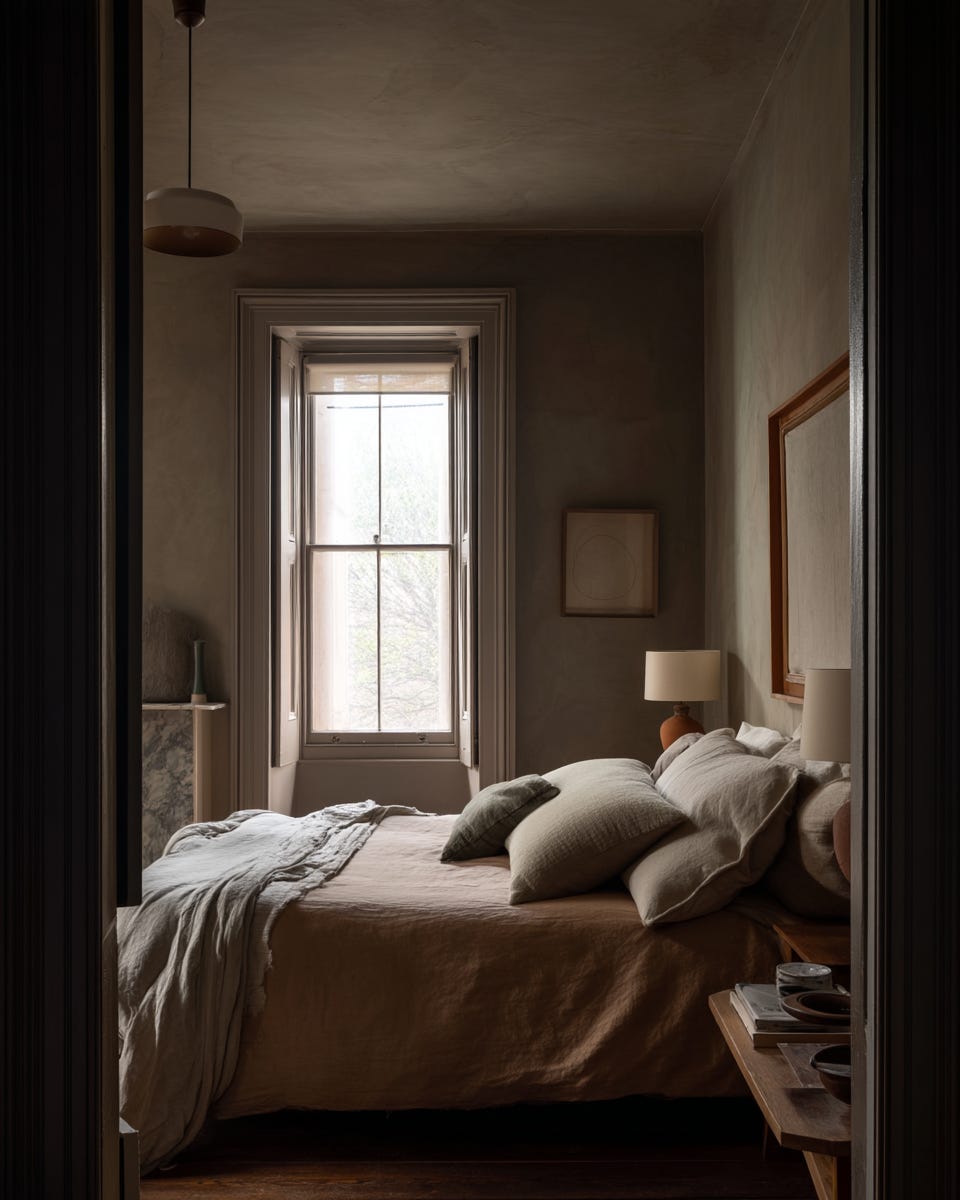
The shift is subtle at first. Light stretches a little further across the floor. Mornings arrive with slightly less effort. One day, without planning to, you carry your coffee to the door and leave it open a fraction longer than before.

The air feels different. Not warm, exactly, but the promise of it is there.

And at night, it is no longer enough to draw the curtains for warmth and against the dark. You want to see outside again. You want to catch the outline of it in the last light, to know it is there, waiting, as if something in you has turned a corner too.

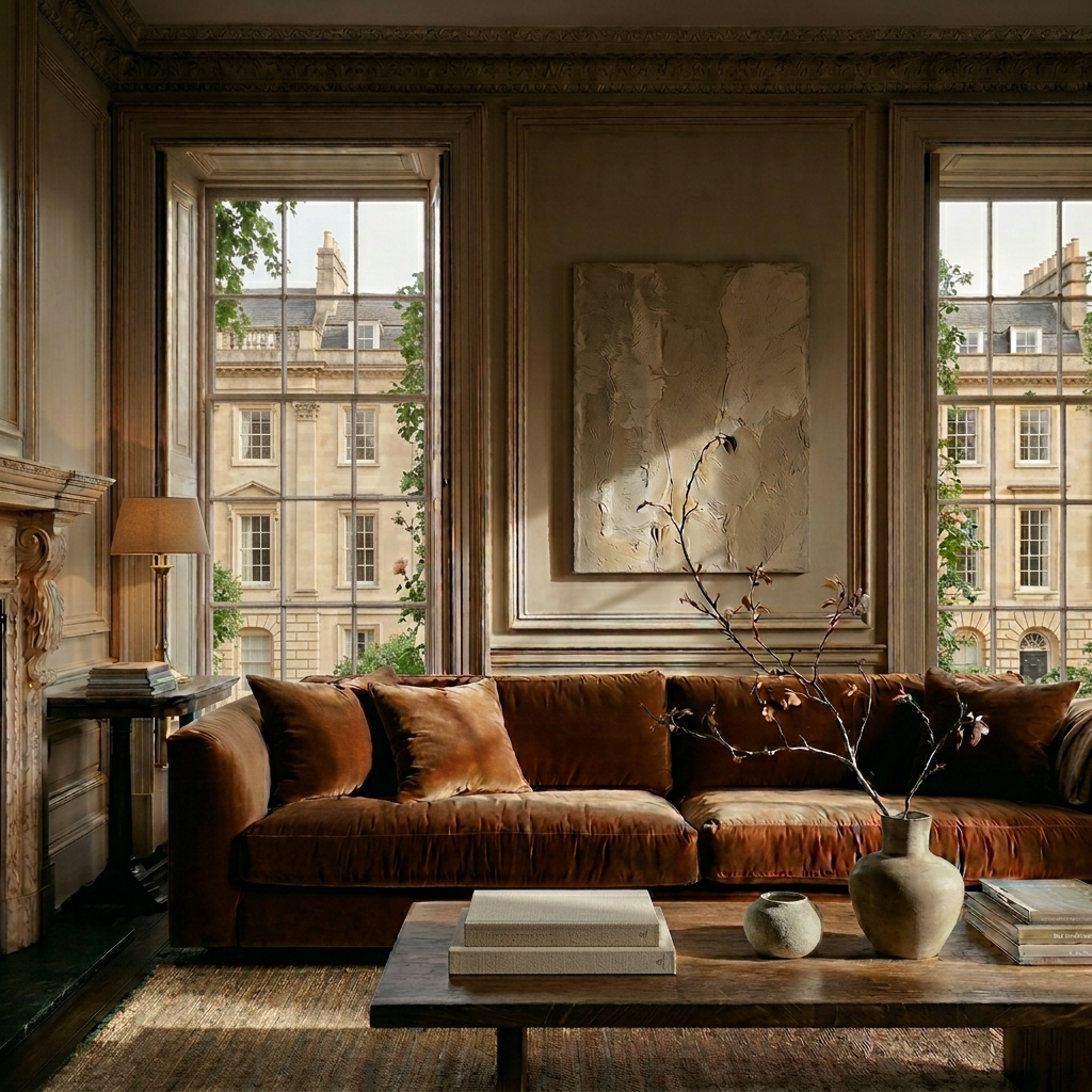
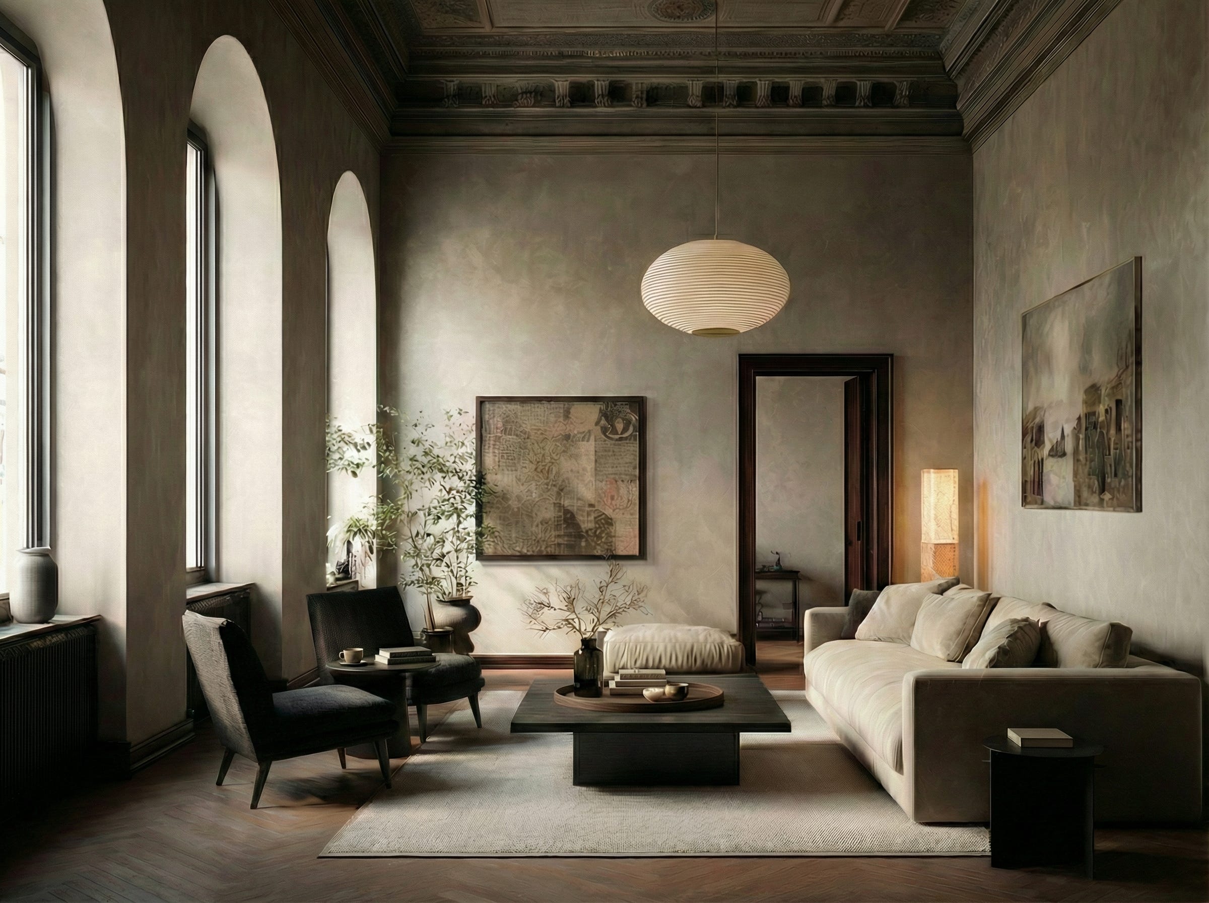
In a city of honeyed stone like Bath, the walls are thick and centuries old. They know how to hold heat. They know how to shelter. But even the most solid architecture must breathe.

The courtyard – enclosed, structured, protected – becomes the fifth room.

Not just a garden, nor a backdrop. Something closer to a room in its own right.

It may be a walled square of Bath stone softened with lavender and clipped box. It may be a small corner carved from a larger communal garden. It may be a balcony edged with terracotta pots and rosemary within reach of the kitchen door.

And yet we rarely think of these spaces as rooms.

The scale hardly matters. What matters is the edge: low walls that hold warmth, planting that softens sound, filtered light that steadies the eye.

I have been thinking about this since working in Dallas a few years ago. There I saw outdoor spaces that stopped me entirely. Not gardens but rooms. Of course the climate is different, but what struck me wasn’t the weather. It was the thinking.

Fireplaces with marble surrounds acting as focal points. Deep sofas with proper cushions. Rugs anchoring conversation groupings on stone floors. Pendants hung from tree canopies, turning branches into ceilings – all the gestures of a drawing room, simply moved outside.

None of it was pretending to be indoors. But all of it had been designed with the same atmospheric intelligence you would bring to a drawing room. There was a focal point, intention, and a reason to be there after dark.

The spaces had been designed as rooms. I have never quite stopped thinking about what that might look like here.

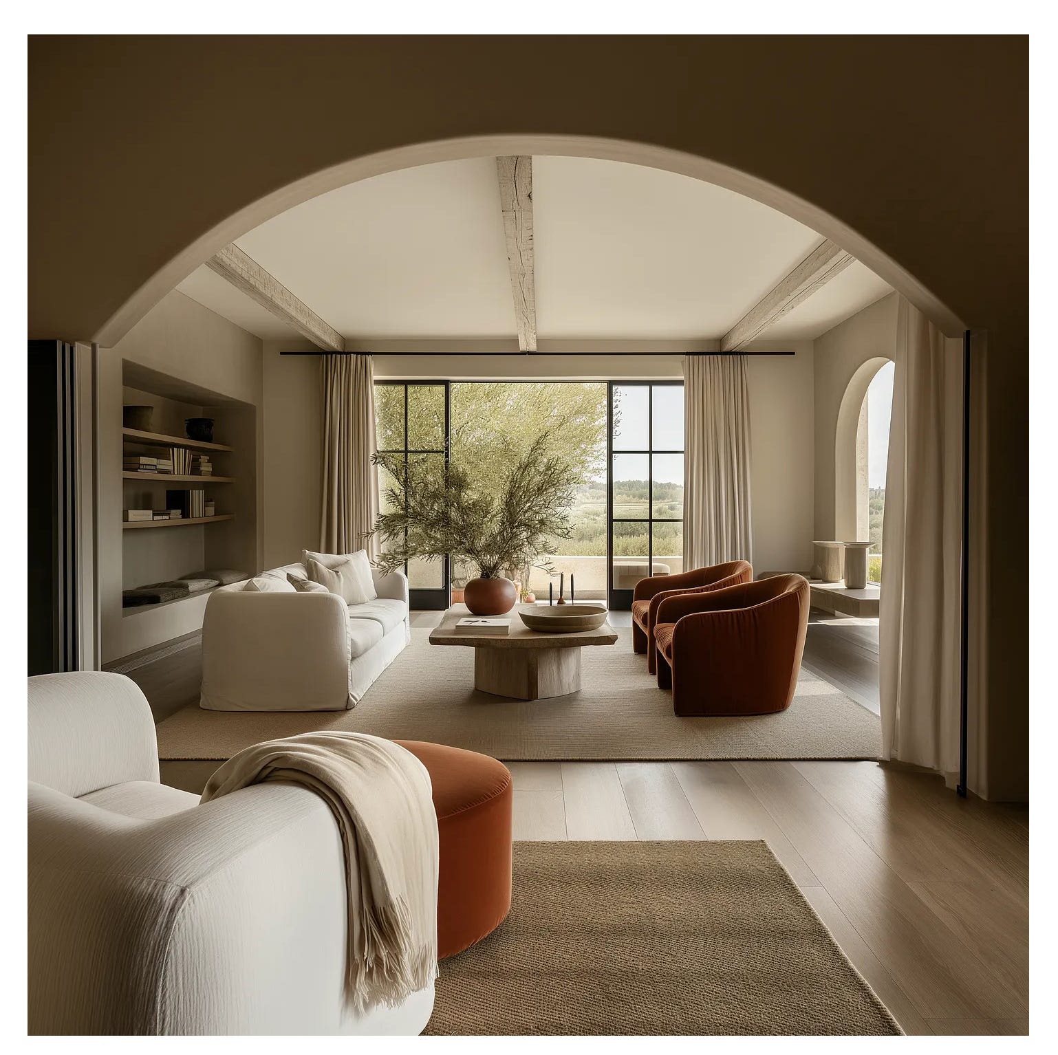
The most successful outdoor rooms understand this instinctively. They are not open landscapes but contained expanses – spaces defined by walls, planting or architecture – allowing you to be alone without feeling isolated, together without feeling on display.

The architecture of outdoor living

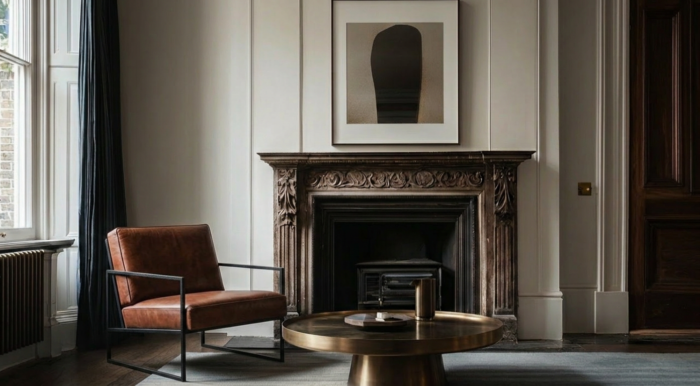
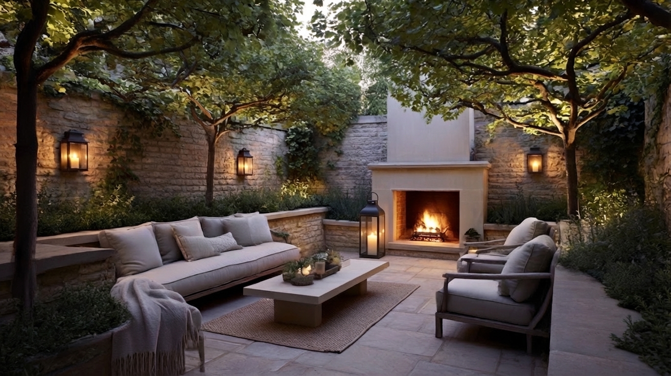
A fire pit is a gathering object. A fireplace however creates a room.

That distinction matters. A fire pit can be decorative, but a fireplace changes the whole logic of the space. It gives the eye somewhere to settle, the body somewhere to orient, and the evening a reason to continue. It is not just warmth; it is structure. It is the outdoor equivalent of a mantelpiece, a point around which atmosphere gathers.

And once you begin to think that way, everything changes.

A surface is somewhere you put things.
A space is somewhere you feel something.

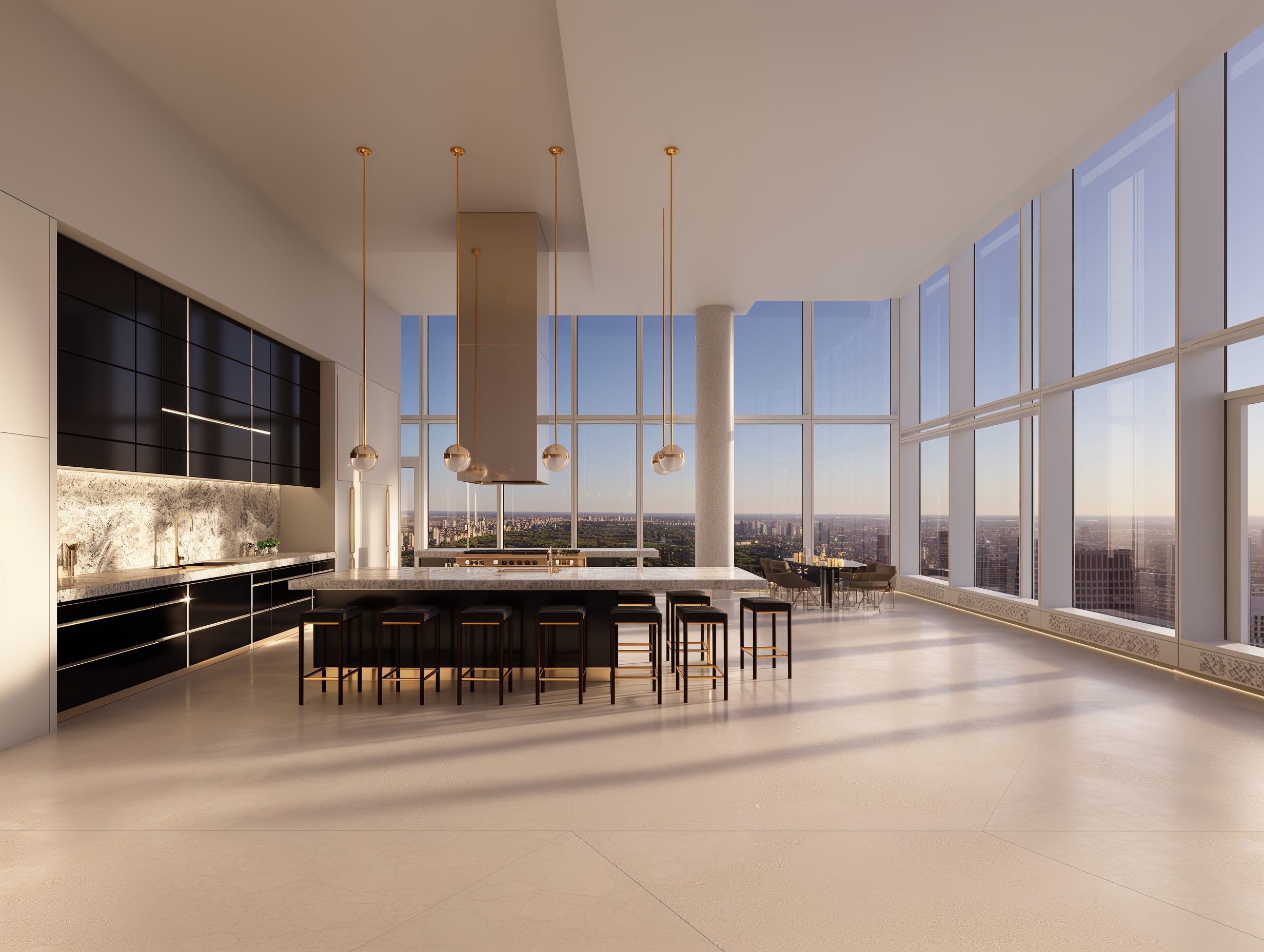
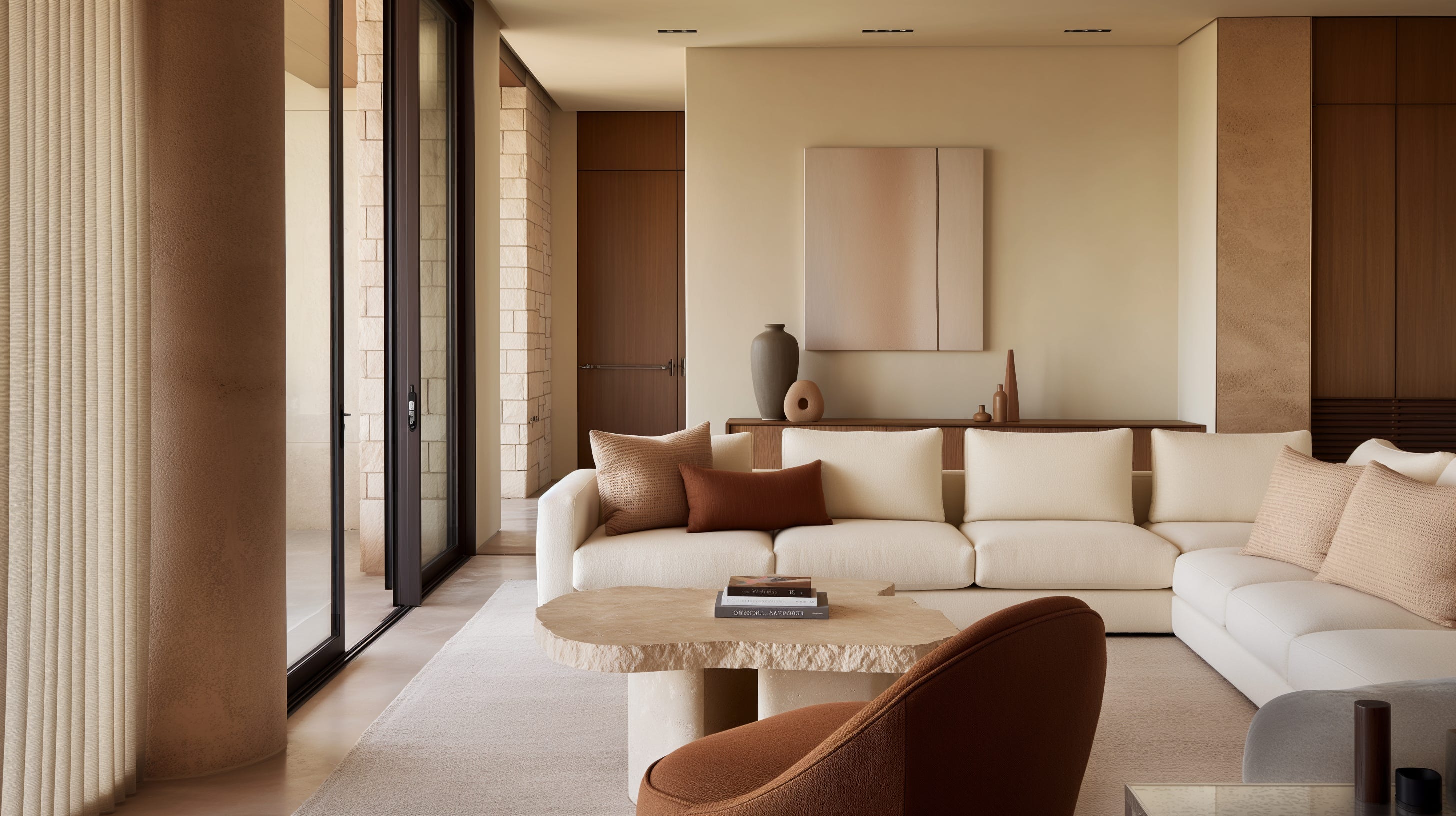
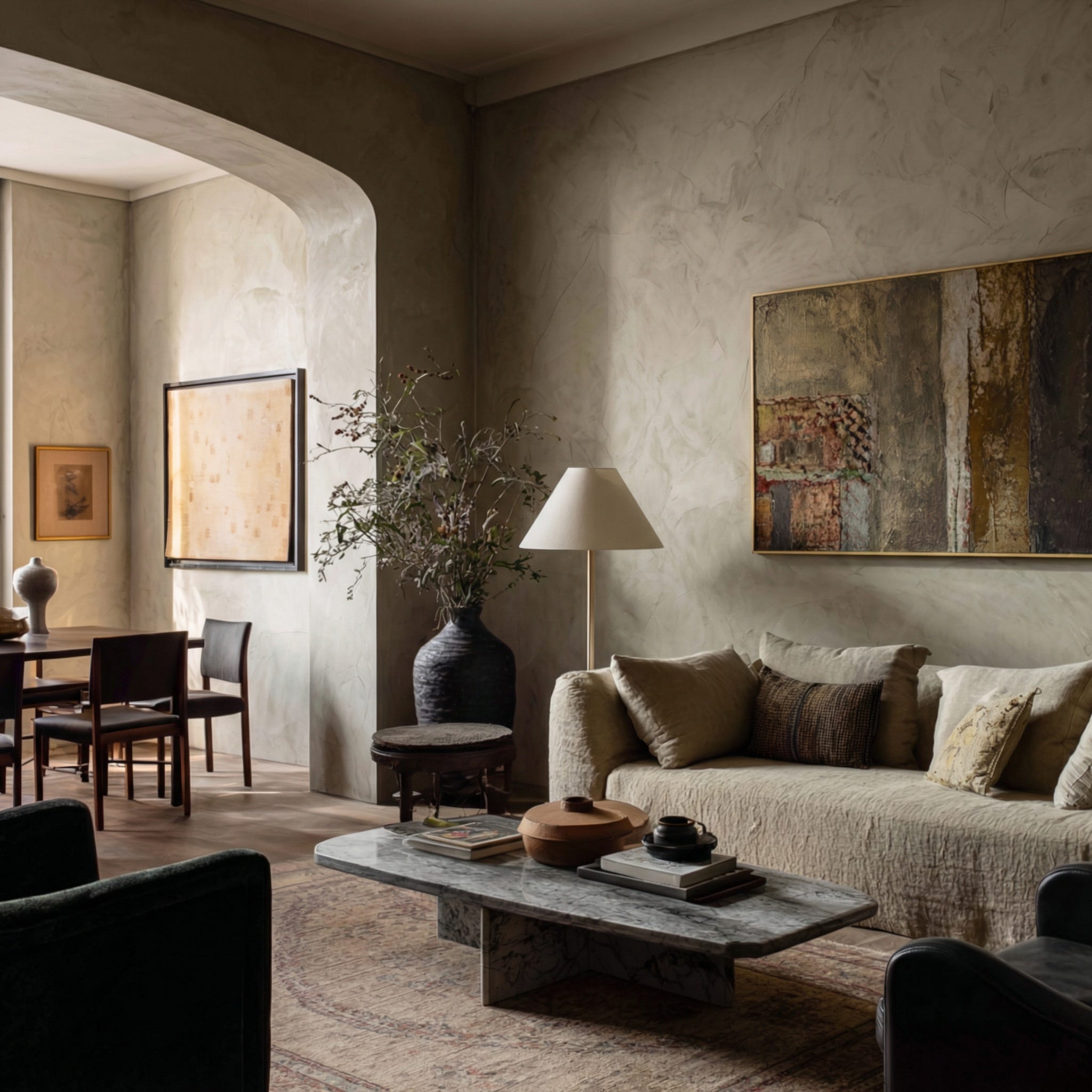
The properties I work with – Georgian townhouses in Bath, farmhouses in Somerset, barn conversions on the edge of the Cotswolds – often have outdoor areas that are under-designed relative to the care given to the interior. The pattern repeats itself in different forms.

A walled courtyard garden receiving the same afternoon light as the drawing room it opens from, yet never treated as its continuation. A stone terrace beyond the kitchen looking across fields, holding a weathered teak table and little else.

These are not minor oversights. They are entire rooms that do not yet exist.

What makes an outdoor space a room is not shelter, though shelter helps – a pergola catching the light, a wall holding warmth, a canopy of branches softening the sky. It is not even furniture, though furniture matters.

It is the presence of something that anchors the space – a focal point with enough weight to say: this place has been considered.

A limestone fireplace.
A substantial lighting moment.
A built-in seat that follows the curve of a wall.

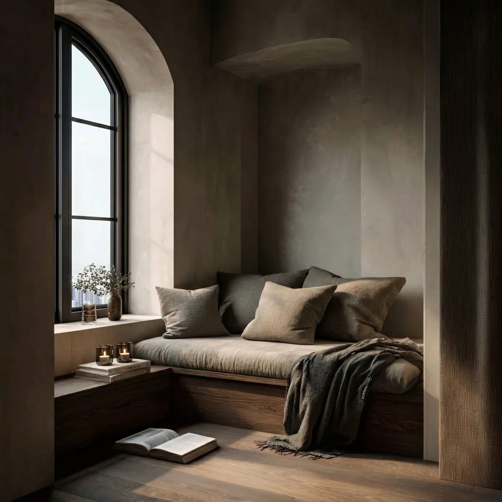
The kind of detail that makes you understand immediately that someone has thought carefully about how this space will feel at seven in the evening in October, not just at noon in July.

Add seating designed for lingering rather than perching. A rug that defines the room’s boundary the way a rug does inside. Lighting placed deliberately rather than strung. Planting that becomes fragrant in the evening – roses, herbs, nepeta, brushed lightly as you pass. The Cotswold stone walls already holding the warmth of the day long after the sun has moved.

Even the practical obstacles have largely disappeared now. Textiles designed for outdoor performance mean upholstery and rugs can live comfortably outside.

A real outdoor room also acknowledges the seasons.

Fire for cool evenings.
Soft light as the days shorten.
Blankets close at hand when the temperature drops.
Planting that releases its scent at dusk.

Suddenly the space begins to behave like a room. And the room gets used.

In many ways, the idea is not entirely new. Historic houses often had their own versions of outdoor rooms – orangeries, loggias, winter gardens – spaces designed to sit between house and landscape. Later, conservatories attempted something similar, bringing light and garden closer to the house, even if the architecture was not always successful.

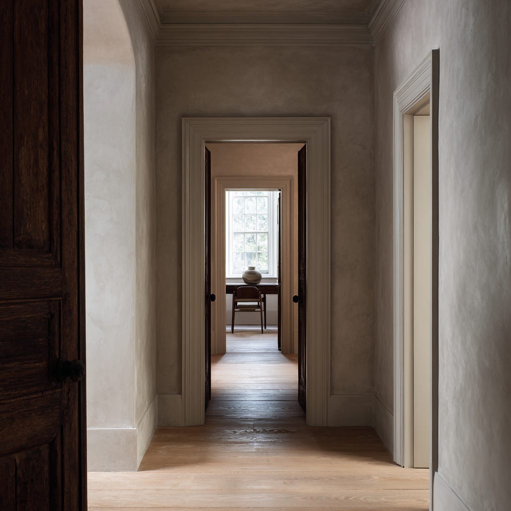
What feels different now is that we have the opportunity to design these threshold spaces more deliberately.

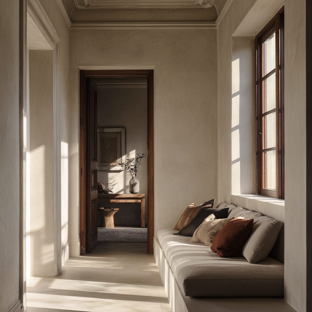
The most successful outdoor rooms begin exactly there – at the threshold. The moment when the interior releases you into the garden but still holds you within its atmosphere. A change in level. A pair of doors opening onto stone. Branches forming a gentle ceiling above the terrace. Curtains stirring softly in the evening air.

This is what I mean by The Fifth Room.

Not garden design or outdoor furniture styling.

The application of the same atmospheric intelligence we bring to interiors – sequence, sensory layering, proportion, the feeling a space produces in the body – to the space just beyond the threshold.

Because the boundary between inside and outside is not fixed. It is simply a threshold. And thresholds after all, are meant to be crossed.

With thanks,

Kate

Heritage, Modernised

Over the past few months I’ve been writing about atmosphere, proportion and the emotional undercurrent of a room. This essay sits a little closer to home: what happens when those ideas meet an older house – one that already carries its own rhythm and its own undertow of continuity.

Heritage, to me, is not something to preserve in amber.
It is something to live within.

Living and designing in Bath, I am constantly reminded that proportion, light and restraint are not trends – they are architectural principles that endure. Georgian streets here are not decorative backdrops; they are carefully considered compositions. That sense of intention still shapes how these homes feel today.

There is a particular steadiness in an older house; it isn’t nostalgia, it is structure – a quieting of the nervous system you can feel as soon as you cross the threshold. The rhythm of sash windows. The authority of cornicing. The rounded edge of a bannister polished by decades of touch. They carry memory – and invite reinterpretation.

To modernise a heritage home, then, is not to overwrite it.
It is to enter into dialogue with it.

A Dialogue Between Past and Present

Walk into any period house and you sense it immediately – a presence in the architecture. Original panelling. Considered symmetry. Floors that have carried generations. These elements were built with permanence in mind. That permanence still registers.

In my work at Reverie, I begin with a simple understanding: utility and beauty are not opposing forces. The past offers rhythm and architectural order; the present offers comfort and clarity. When balanced carefully, the result is neither nostalgic nor stark – but entirely of the present. Heritage becomes a framework, not a constraint.

Why Historic Homes Still Resonate

In Britain especially, we tend to adapt rather than rebuild. Our housing stock is layered – terraces and villas, country houses and village homes, post-war additions and later infill – streets and settlements that have evolved over centuries. Each holds traces of earlier lives; each has been quietly reinterpreted by the generations who have lived there.

The appeal is deeper than romance. Historic homes offer architectural dignity and a sense of continuity in an increasingly transient world. Their materials age into beauty rather than away from it, creating depth and shadow without excess.

Even in modest cottages or narrower terraces, there is often coherence in the scale and composition. These buildings were constructed with care, and that care still shapes how we feel within them. It is not grandeur that moves us, but intention.

There is something particular in the way we live here – an instinct that reaches toward continuity rather than reinvention. A Georgian apartment or old rectory carries established identity without announcing it: an assurance that feels rooted rather than performed. In a culture that has long associated heritage with restraint and proportion, these homes do not need to declare themselves. They simply endure.

Part of the appeal is that many of these homes resist fashion. Storage may be limited, bathrooms fewer than we would choose today, yet there is a fundamental rightness to their bones that prevents them from feeling disposable. It is a composed confidence – one that does not announce itself, but endures.

Of course, not everyone is drawn to this kind of architectural stillness. For some, the energy of a larger city offers a different kind of vitality – sharper, faster, more overtly modern. The appeal of heritage is not universal. But for those who respond to it, the calm of stone, symmetry and considered scale offers something deeply regulating: a backdrop that steadies rather than stimulates.

That is not to say contemporary architecture lacks appeal. A beautifully designed modern house – generous in scale, flooded with light, deeply sustainable – can feel equally compelling. The distinction is not about superiority, but about resonance. Period homes often arrive with a built-in composure that many of us recognise immediately.

The Realities of Period Properties

To live beautifully in a heritage home requires intelligence as much as taste. These houses were not designed for the way we live now – modern heating, the expectation of light in every room, kitchens that sit at the heart of daily life rather than hidden behind closed doors.

But sensitive modernisation is not about correcting what exists. It is about listening to what the building needs, and responding with care rather than imposition. A well-considered rooflight that draws morning sun into a dark hallway. A kitchen relocated into the most generous room in the house, where proportion and light already exist. Heating that breathes with the fabric of the building – layered window treatments, zoned warmth, materials that allow the walls to regulate moisture as they were designed to do. These interventions, when handled thoughtfully, become invisible. Which is exactly as it should be.

In listed properties, planning constraints are real and worth engaging with early. At times they can feel prohibitive, but the rewards of working carefully within them are often profound. A designer who understands heritage buildings knows how to work with conservation officers, not against them – how to introduce a bathroom or reconfigure a layout in ways that feel entirely natural to the building’s rhythm. The intention is never correction. It is evolution.

How Heritage and Modernity Meet

The most compelling period interiors are not those that choose between past and present, but those that allow the two to sit in considered conversation.

A sculptural contemporary pendant suspended within a classical Georgian drawing room creates tension – and tension creates interest. Original panelling retained, but furniture streamlined and restrained so the room can breathe, and the architecture find space to be felt. Textiles chosen for their stillness – linen, wool, natural fibres that defer to the building.

The most vital heritage interiors are never museums. A room frozen in its period – however beautifully – loses something essential: the sense that life is still happening within it. What gives these spaces their charge is often the very thing that might seem at odds with them. A raw concrete worktop in a Georgian kitchen. A stark contemporary chair set against original panelling. A single bold artwork on a wall of Victorian cornicing. These are not intrusions. They are evidence of continued habitation – of a house that has moved through time rather than stopped in it.

Contrast, handled with conviction, is not a problem to be solved. It is what keeps a heritage interior from becoming merely decorative. The tension between then and now – when it is felt rather than forced – is precisely what makes these rooms feel alive.

When a room already holds architectural richness, modern restraint allows that richness to be felt rather than overwhelmed. The two do not compete; they complete each other.

The best heritage interiors feel anchored in their history, yet entirely at ease in the present. This, to me, is what heritage modern truly is: not a look, but a relationship between time, proportion and daily life.

This, to me, is what heritage modern truly is: not a look, but a relationship between time, proportion and daily life.

Living with Heritage

Historic houses offer something that cannot be manufactured: atmosphere. They carry rhythm in their proportions and reassurance in their permanence. In a culture of constant reinvention, there is comfort in living within walls that have endured; they lend a kind of temporal ballast to everyday life.

When designed thoughtfully, these homes do not feel old-fashioned. They feel anchored – secure in their identity, yet entirely capable of supporting contemporary life. Heritage homes are not fragile; they are resilient. And when handled with intelligence and restraint, they become some of the most compelling interiors of all.

I am drawn to the in-between – where contrast settles, proportion calms, and history and modern life meet without friction. In Bath and beyond, heritage homes deserve not preservation alone, but thoughtful continuation.

The Heritage Modern Playlist

Because atmosphere extends beyond what we see. This is what it sounds like to me: a London townhouse at dusk, a cool country gathering, a room that understands its lineage but is entirely at ease in the present. A heritage home does not ask to be frozen in time. It asks to be understood. Listen here:

Best heard in the background, with the lights low and the house quiet.

If you are considering modernising a period home in Bath or beyond, I would be delighted to help you shape its next chapter.

Kate

Reverie

Thresholds: Why We Need Edges Again

There was a time when rooms didn’t dissolve into one another – you entered them.
You crossed a line – sometimes a door, sometimes only light or shadow – and something shifted. Your body registered the change before your mind caught up. The outside world softened. The pace altered. You arrived.

These moments are called thresholds.
And somewhere along the way, we decided we no longer needed them.

Arrival Has Disappeared

Modern interiors prize openness – flow, continuity.

Walls came down. Sightlines stretched. Rooms blurred together in the name of ease and openess.
And yet, many people now describe their homes as restless – beautiful, but strangely difficult to settle into.

When everything connects, nothing truly begins.

Arrival has quietly vanished from domestic life.
And with it, the subtle emotional reset that allows us to move from one state to another – from outside to inside, from activity to rest, from public to private.

The Rise of the Great Room

For many years, openness has been presented as the architectural ideal – a generous, light-filled space where kitchen, dining, and living gather into one continuous heart.

This wasn’t a sudden invention.
Long before the “Great Room” was named, partitions were already dissolving – from loft conversions to late-century modern planning – in pursuit of flexibility, informality, and light.
The Great Room simply crystallised this shift into a domestic aspiration.

In warmer climates, and in homes built with space to spare, this model breathes easily.
Heat drifts. Inside and outside soften into one another. Boundaries loosen without tension.

But as the ideal travelled – into older buildings, cooler atmospheres, and more layered patterns of daily life – it was often adopted without translation.

Walls were removed.
Pauses were not replaced.

The centre of the home expanded – and quietly lost definition.

What disappeared wasn’t connection.
Nor togetherness.

It was the space between –
the moment of transition that allows us to arrive.

What a Threshold Really Is

A threshold isn’t about separation.
It’s about transition.

It is the pause that allows one experience to dissolve before the next begins – a moment of recalibration felt before it is understood.

A threshold signals: something is changing now.

It doesn’t require a door or a wall.
Often, the most powerful thresholds are barely visible – a shift in light, a narrowing of space, a change underfoot.
They work quietly, but deeply.

In a world with fewer edges – endless scrolling, open inboxes, blurred boundaries – the home has quietly become our last place of reset.

Edges as Emotional Architecture

Good interiors don’t just accommodate movement.
They choreograph it.

A well-considered threshold might be a moment of compression before release, shadow before brightness, or softness before stillness. These cues help the body understand how to behave in a space – when to slow, when to gather, when to rest.

This is emotional architecture.
Not decorative. Not symbolic.
But felt.

Why Open Plan Needs Edges

Open-plan living has given us generosity, light, and togetherness – and I love it. But without moments of transition, even the most beautiful spaces can feel emotionally unresolved.

Open plan isn’t the problem.
Unedited openness is.

Without thresholds, the home is asked to hold every role at once: workplace, family hub, retreat, social space. These states collide rather than transition.

What’s missing isn’t openness –
it’s containment within openness.

Edges give expansive spaces rhythm.
They allow different moods to coexist without competing.
They introduce hierarchy, calm, and clarity without sacrificing light or generosity.

Designing the In-Between

Reintroducing thresholds doesn’t mean building walls everywhere.
It means designing moments.

A subtle step in level.
A change in ceiling height.
A curtain instead of a door.
A shift in material, texture, or acoustics.
A framed view that signals pause before entry.
A shift in scent, sound, or temperature.

Historically, these gestures were reinforced by necessity – rugs to hold warmth, doors to manage heat, curtains to soften draughts. Not decorative decisions, but behavioural ones.
They shaped how long we stayed, where we gathered, how we rested.

These gestures don’t shout.
They guide us.

They allow the body to arrive before the mind needs to.

Containment as Care

Thresholds are a form of care.

They offer permission to leave one state behind before entering another.
They shape spaces that feel held rather than exposed – restorative rather than performative.

Containment isn’t confinement.
It is what allows us to soften.
To settle.
To relax.

A Return to Gentle Boundaries

This isn’t about nostalgia.
It’s about necessity.

We don’t need more openness.
We need better transitions.

Thresholds remind us that movement matters – that pauses are valuable – and that arriving is as important as being there.

A threshold is an act of kindness –
a quiet edge that allows life, and light, to change with grace

From The Reverie Edit

Kate

Reverie

Designing for Regulation, Not Reaction

As we move into 2026, homes are being asked to do something more than perform.

For years, homes were designed to impress, to photograph well, to signal taste. Increasingly, they are being asked to regulate. To soften the nervous system, reduce visual tension, and support how we actually live.

This is not a new aesthetic.

Curved furniture, earthy and mineral palettes – plaster, stone, chalked neutrals and warm timber – tactility and softness have surfaced repeatedly over the last decade, especially in boutique hotels and European interiors, before becoming part of everyday language in the home. Many designers have been working with these ideas instinctively for years.

What has changed is not their appearance, but their persistence – and the clarity with which we now understand why they matter.

Prolonged digital intensity, environmental uncertainty, and accelerated pace have reshaped what we need from home. Stimulation, once read as excitement, increasingly registers as fatigue. Calm is no longer an absence of design; it is a function of it.

This is where neuroaesthetics enters the conversation – not as a trend, but as a framework. Light, proportion, material, colour and sound all register in the body. Design can either keep us alert or allow us to settle.

The difference is often simple. A room lit by harsh overhead glare, sound bouncing off hard surfaces, sharp‑edged furniture and echoing, open spans; belongings stored in ways that force constant micro‑decisions. Versus a space shaped by layered lamp light, softened acoustics, rounded sofas, arched thresholds, timber and mineral surfaces, clear circulation and intuitive storage. One heightens vigilance and cognitive load. The other allows the body – and the mind – to exhale.

In this context, restraint is not minimalism. It is care.

Colour shifts from contrast to temperature – from stark oppositions to layered neutrals and deeper, earth‑rooted hues that hold the eye rather than jolt it. Used in the right proportions, inky blues, bottle greens and browned reds read as anchoring rather than overpowering. Texture becomes grounding rather than decorative. Light moves from theatrical to physiological. Layout, storage and sightlines are treated as forms of cognitive off‑loading, reducing background noise for busy and sensitive minds alike.

The goal is not novelty, but regulation.

This also helps explain the renewed pull toward heritage architecture. Not because period homes are inherently “better”, but because many were drawn around the body rather than the camera: thicker walls, deeper reveals, clearer thresholds, a natural rhythm of rooms. When thoughtfully adapted, they offer something increasingly rare in open‑plan, screen‑filled life: spaces that contain you, limit visual noise and give the nervous system a clear sense of where it begins and ends.

Luxury, in this landscape, is no longer loud. It is measured. Considered. Quietly intelligent.

It is also quieter in its sustainability. The more we design bones that can endure – well‑proportioned rooms, robust materials, calm storage – the less often we need to rip things out and start again.

At Reverie, design begins not with a look, but with a feeling – how a room holds you at the end of the day, how light moves through it, how materials age and respond to touch. How clearly a space explains itself to you, even when you are tired or overstimulated.

This is not about predicting the future of interiors.

It is about recognising what the body has been asking for – consistently, quietly – and responding with intention.

Kate

Reverie

Rooms That Hold You

Colour has slipped back into the home not as spectacle, but as emotional architecture = deepening evenings, clearing mornings and softening the spaces that hold everyday life. This essay looks beyond the 2026 Pinterest palette to ask which colours are truly willing to live with us over time.

For a decade, restraint has set the tone for considered interiors: soft whites, warm earth tones, spaces designed to recede rather than insist. Neutrals did important work, calming the eye while architecture, material and light took the lead. They still do.

Yet beneath this quiet, something has been gathering. The 2026 Pinterest Palette – Persimmon, Cool Blue, Jade, Plum Noir and Wasabi — is being framed as high‑impact colour, saturated enough to cut through both screen and street. But what matters for the home is not their visual volume; it is the emotional work they are being asked to do.

What is emerging now is not a rejection of neutrality, but a more emotionally literate layering over it. Homes are still grounded in brown — timber, leather, clay, tobacco, walnut — yet colour is being reintroduced as punctuation: specific hues placed where the body needs containment, clarity, reassurance or connection. The body needs containment, clarity, reassurance or connection. The question is no longer which colour is trending, but which colour is willing to live with us now.

Colour as Emotional Architecture

In 2016, colour in the home often floated. Pastels, millennial pinks and optimistic blues sat lightly on bright, white shells, promising progress and ease. A decade on, life feels heavier, more complex. Colour has followed.

Today, the hues rising through platforms like Pinterest carry names loaded with mood: Cool Blue, Jade, Plum Noir, Persimmon, Wasabi. Each is presented as an attitude – serenity, mystery, joy, defiance – yet in the home, their power depends less on personality than behaviour. A colour belongs indoors when it regulates rather than performs; when it helps a room hold its occupants, not just photograph well.

Used this way, colour behaves less like surface and more like architecture. It shapes how space is experienced over hours, days and years: how the nervous system settles on the sofa at night, how the mind clears at first light, how a hallway feels as you cross it for the hundredth time.

Not Every Colour Wants to Live With Us

Not every colour that captures attention endures in a home.

Wasabi is a useful example here precisely because it exposes the difference between cultural visibility and domestic endurance. An electric chartreuse gaining ground across beauty, streetwear and event styling, it is tuned to the speed of visual culture. It thrives on contrast, spotlight, the quick hit of the scroll – a colour that may be thrilling to wear but rarely wants to settle on a wall.

Domestic space asks for something different. Colours that endure at home tend to share a quieter profile: they steady rather than spike, soften rather than shout, deepen rather than distract. They are chosen for the way they feel when experienced repeatedly and peripherally, not for the impact of a single image.

The emerging distinction is between colours that perform culturally and colours that support life. The Pinterest Palette captures both — hues built for visibility and hues that support dwelling.

Plum Noir – Depth, Evening, Containment

Among the five, Plum Noir translates most naturally into interiors. Described as dark and decadent and tied to ideas of main‑character energy, it absorbs light instead of reflecting it. In rooms, this reduction of visual noise is exactly where its strength lies.

Used on walls, upholstery or cabinetry, these deep plum tones draw the edges of a space inward, creating enclosure in homes that have spent years chasing openness and brightness. They are particularly at home in evening rooms — dining spaces, libraries, snug sitting rooms – where conversation lengthens and the day loosens its grip.

Paired with brown woods, aged metals and low, layered light, Plum Noir ceases to feel theatrical and instead becomes containing. It allows a room to recede into atmosphere rather than posture as a backdrop. Plum is not a colour for display; it is a colour for being held.

Cool Blue – Clarity, Reset, Breath

If Plum Noir works through depth, Cool Blue operates through clarity. Pinterest connects this hue to mental resets, and a craving for clean focus in an overstimulated world. Unlike the sugary pastels of the last decade, this blue is mineral, chalked, almost weightless.

In the home, Cool Blue belongs where the mind needs to soften its edges: bathrooms at first light, studies, dressing spaces, quiet bedrooms. It does not warm a room; it clears it. Used alongside warm browns and natural textures, it introduces air without chill – a visual deep breath rather than a high‑contrast statement.

In an era of constant input, this sort of clarity has become quietly essential. It is not about escapism, but about the everyday relief of a room that asks less of you the moment you enter.

Jade – Grounding, Soft Authority, Reassurance

Jade is being framed as quiet luxury’s favourite green. It sits somewhere between celadon and moss, behaving almost like a new neutral. Crucially, it is not the botanical green of houseplant maximalism, nor the sage that saturated the last wave of interior trends. It is cooler, stone‑softened, more architectural than decorative.

These mineral greens sit comfortably against brown – oak, walnut, leather, suede – grounding a space without darkening it. They lend a calm, grown‑up presence to kitchens, headboards or the single armchair where the day reliably slows.

Emotionally, Jade does not dazzle. It reassures. It offers a kind of soft authority, steadying a room so that other elements – books, textiles, the messiness of life – can express themselves without tipping into chaos.

Persimmon – Warmth, Memory, Human Presence

Persimmon, described as a sunset‑soaked blend of red and orange that radiates joy and nostalgia, has been gaining momentum in searches for orange suits, colour combinations and aesthetic references. It is a colour of contact zones – parties, lipstick, lacquered nails, saturated photographs.

In the home, its sharpest iterations can easily overpower. The version that truly lives with us is softened – closer to rust, clay and sun‑warmed fruit than to neon sportswear. Used as a lampshade, a piece of art, a glazed ceramic or the surprise lining of a curtain caught in evening light, Persimmon becomes connective rather than loud.

Set against brown, it echoes skin, terracotta, worn leather. Instead of shouting for attention, it gently humanises spaces that risk feeling austere, introducing warmth without weight and nostalgia without pastiche.

Why Now? 2016, 2026 and the Weight of Colour

The current palette cannot be separated from the culture that produced it. Ten years ago, interiors leaned into optimistic minimalism: marble‑splashed benchtops, rose‑gold accents, greenery in every corner and a spectrum of millennial pinks and greens promising a better, lighter future. Colour acted as a buoyant overlay, a promise that things were moving forward.

Today’s conditions are different. Pinterest’s data‑driven forecast arises from billions of saves and searches at a time when people are using colour not only to signal taste but to manage mood. The dominant neutral of 2026 – warm white framed as a refuge from a noisy world — mirrors that shift, offering calm rather than optimism.

Against that quieter base, the new hues carry more weight. They sit closer to the body – in nails, knitwear, beauty looks – before entering the home. They are less about novelty and more about modulation: deepening evenings, clarifying mornings, grounding daily rituals, warming points of contact. The question has shifted from what’s in to what supports the way we actually live now.

From Quiet Luxury to Precise Care

Quiet luxury has been declared over as often as it has been named, yet what is unfolding is not an ending but a refinement. The future is less about absence – blank, beige anonymity – and more about intention: knowing where depth belongs, where lightness is needed, where warmth should gather and where a room ought to simply recede.

For most homes, that will mean a light, soft base anchored by warmth – ivory, stone and pale neutrals grounded by timber, leather and clay – with colour reserved for the places where the day actually touches the room: the table edge, the reading chair, the view. Colour, used in this way, disappears into feeling. It becomes a form of care rather than spectacle: the plum cocoon that makes a winter evening bearable; the blue‑washed bathroom that clears the mind; the jade kitchen that hums along with the rhythm of everyday life; the persimmon flash that reminds a restrained space it is still inhabited by people.

The most enduring homes of this next decade will not be those that chase each palette as it drops, nor those that cling rigidly to neutrality. They will be the ones that treat colour as emotional architecture – not everywhere, but exactly where it matters.

Kate

Reverie

How Interiors Are Quietly Recalibrating in 2026

How Interiors Are Quietly Recalibrating in 2026

Reading familiar forms through a deeper lens

Much of what is shaping interiors now is not new. Curved seating, earthy palettes, tactility, softness, and a return to proportion have surfaced repeatedly over the last decade – often first in European interiors, hospitality spaces, and fashion‑led environments before filtering into the residential mainstream. Designers have long understood their appeal.

What feels different now is not what we are seeing, but why these ideas have endured – and why they are coming together so clearly at this moment.

From rustic modern rooms and lived‑in luxury to sculptural lighting, refined maximalism and a renewed interest in softer, more tempered materials, the looks being labelled “trends” for 2026 are all expressions of the same underlying shift: homes designed to regulate, not perform.

When ideas return again and again – evolving rather than disappearing – they stop being trends.
They become structural.

“Thresholds and proportion doing the work before decoration.”

Depth, warmth and mineral restraint

These tones are not new: soft clays, limestone whites, chalked neutrals, muted ochres and tobacco shades have circulated through European interiors for years. What has changed is not their presence, but the intention behind their use.​

Chosen now for their weight and temperature rather than their novelty, these colours absorb light gently, soften contrast and reduce visual friction. They steady a space. The body reads them as calm, grounded and reassuring.​

Deeper shades in this spectrum – inky blues, aubergines, espresso browns and earthy olives – are emerging as anchoring colours for 2026, used to wrap rooms in a sense of depth rather than to shout for attention. Within that, inky and mineral blues are adding a quiet clarity to the palette, bringing a sense of freshness without visual sharpness.​

When paired with natural materials, these hues behave less like feature colours and more like refined neutrals – calm enough to live with for years, yet exact enough to lift a room emotionally. This is colour used to stabilise rather than stimulate – particularly relevant in homes where attention is already stretched, whether through demanding work, constant digital input, or heightened sensory awareness.​

Curves, containment and softened geometry

Rounded sofas. Barrel‑back chairs. Arched thresholds. Bull‑nosed edges.

Curves are not a revival; they are a response. Sharp geometry keeps the body alert. Enclosing forms soften transitions and create a sense of containment.

In a culture shaped by constant input, this gentler geometry offers relief. It allows the body to settle rather than brace – supporting somatic calm for both neurotypical and neurodivergent occupants.

Lighting designed around rhythm, not drama

Layered lamps. Shaded pendants. Pools of light.

Lighting has long been discussed aesthetically. It is now being understood biologically. Harsh overhead glare disrupts rhythm and rest; layered light supports transition, focus and recovery.

The most compelling interiors feel good at 8am and at 8pm – not because they impress, but because they support. They offer gradations of brightness that different nervous systems can adjust to rather than endure.

Texture, tactility and acoustic softness

Textiles, rugs, heavier curtains, layered upholstery.

Texture has moved beyond decoration. Soft materials calm the auditory environment as much as the visual one – absorbing sound, reducing echo, and creating spaces that feel quieter, slower and more humane.

This is why rooms are increasingly cocooning rather than sparse. For people who find noise and reverberation particularly draining, these choices are not indulgence; they are access.

A refined relationship with maximalism

Pattern, colour, memory and richness – held with intention.

Maximalism was not a detour. It was a necessary phase of emotional expression: a reclaiming of identity and joy during a period of instability. What we are seeing now is not its rejection, but its refinement.

Richness is being held within structure. Expression is supported by calm. Visual stories are still being told – but with more attention to sightlines, resting points for the eye, and how much information a room asks the brain to process at once.

Softer materials and tempered shine

Pewter, brushed metals, aged brass, mixed finishes.

Highly polished, celebratory surfaces are giving way to materials with gentler reflectivity. This shift is less about fashion cycles and more about sensory response. A softened sheen registers as calmer than a sharp gleam.

This move toward tempered materials reflects a wider desire for environments that feel steady rather than stimulating – surfaces that catch the light quietly, rather than demand attention.

Heritage and proportion – not nostalgia

Rhythm. Symmetry. Human scale.

The renewed interest in heritage is not about looking backwards. It is about legibility. Proportion creates order – and order, in uncertain times, feels like safety.

Clear thresholds, generous reveals, balanced rooms and readable axes reduce cognitive effort. They make a home easier to navigate – physically and mentally – for everyone who lives there.

Many older houses also tend to use depth of wall, window reveals and solid doors to modulate light and sound. When these are sensitively retained, they become built‑in regulating tools – helping to temper brightness, echo and temperature before any decorative layer is added.

When the bones are right, atmosphere does not have to work as hard. Quiet colour, patina and soft furnishings can sit on top of a structure that already feels composed, rather than trying to correct a plan that never quite settles.

The home as habitat

Thresholds. Shade. Planting. Outdoor rooms.

As climate patterns shift, the boundary between inside and outside is being rethought. Exterior space is becoming part of the home’s regulating system – offering airflow, seasonal rhythm and sensory relief.

Pergolas, deep thresholds, planted courtyards and sheltered terraces are no longer lifestyle gestures. They are functional responses to heat, light, and how bodies move through the day.

Longevity, freshness and discernment

None of this suggests interiors should be cautious or devoid of personality. On the contrary – homes still benefit from moments of colour, pattern, surprise and expression.

What defines 2026 is not restraint alone, but discernment.

Enduring architectural decisions – layout, proportion, doors, flooring, core upholstery – are increasingly designed for longevity and regulation. Expressive layers – paint, wallpaper, textiles, lighting and art – are where freshness and cultural energy are allowed to play.

In other words:
the framework regulates; the layers can react.

This distinction is aesthetic, neurological and ecological. The more the framework is designed to endure and hold, the less often they need to be replaced – reducing both cognitive upheaval and material waste.

A recalibration, not a trend

At Reverie, this layered approach is central to how we work.
Not designing to impress at first glance – but to support how a space is lived in over time.

The details will change.
The colours will shift.
But the underlying direction is clear.

Design is becoming less about display – and more about how it feels to be held by a space. Seen through this lens, 2026 feels less like a moment of fashion and more like a collective recalibration toward calmer, more grounded homes.​

These are not theoretical ideas – they show up in the texture of everyday life, in how a room supports you on ordinary mornings as much as on special occasions. If you’ve been sensing this shift in your own home, I hope these thoughts give you language for what you’ve been noticing.​


More reflections to come.

With thanks,
Kate

Begin Again: January Light

A new year. A sense of expectation. The quiet implication that we should already be moving forward – clearer, lighter, more decisive than before.

Yet winter itself offers a different cue.
The light is low and pale, deliberate rather than expansive.
It does not hurry us. It suggests pause.

January light enters a room slowly.
It settles on walls and floors without urgency, revealing the quiet form of a space rather than filling it.

There is clarity in this light – but not the clarity of plans or resolutions.
It is the clarity that comes from stillness.

The Gift of the Quieter Months

There is something quietly special about this time of year, if we allow it to be so.

The world outside may be calling for momentum, but winter asks for something more inward. These are months that invite rest, reflection, and a gentler pace – as much as modern life will allow.
Less urgency. More presence. Fewer decisions made in haste.

It is a season that seems to grant permission:
to write without outcome,
to move at an easier rhythm,
to organise slowly and with care,
to read, to watch films,
to light candles in the afternoon,
to nourish rather than optimise,
to spend time inside without apology – and to seek fresh air and daylight when it feels restorative, not performative.

None of this is about withdrawal.
It is about alignment.

Home as Seasonal Companion

In winter, our homes take on a different role.
They are no longer just places we pass through between commitments.
They become the spaces that carry more of our interior life – holding quiet mornings, early evenings, and the long stretch of time spent indoors.

The way a room feels matters more than how it presents.
Atmosphere takes precedence over efficiency.

This is when warmth, shadow, softness, and rhythm begin to matter deeply – when a home supports not productivity, but presence; when it allows us to slow without explanation.

A place where nothing has to happen.
Where we are not required to perform or progress.

January is often when we realise that a home must support us not just as a household, but as individuals – each with different needs for solitude, comfort, and retreat.

A Softer Kind of Beginning

Beginning again does not have to be loud.
Some beginnings happen quietly — internally, almost imperceptibly at first.

They emerge through small, steady shifts rather than declarations:
a cleared surface,
a gentler morning routine,
a corner of the home reclaimed for reading or reflection,
a sense of space returning.

This is not the beginning of action, but of orientation – a moment to notice what feels steady rather than urgent, what invites calm rather than stimulation.

January offers this pause before form returns.

Light as Companion

Light has always shaped how we experience our homes, but winter light in particular feels companionable.
It reassures rather than energises.
It softens edges.
It allows rooms to breathe.

This is the light that supports quiet days and early evenings — that makes candlelight feel natural rather than decorative, that encourages us to inhabit our spaces slowly, without rushing toward what comes next.

Perhaps this is why so many of the interiors we are drawn to right now feel warmer, calmer, and more considered — not because they are following a trend, but because they allow us to settle.

Beginning Again, Quietly

January does not ask us to transform.
It asks us to listen.
To rest where we can.
To gather warmth.
To allow our homes – and ourselves – to hold still long enough for clarity to emerge naturally.

The light will change soon enough.
For now, it is enough to begin again – quietly, gently, in the softened January light.

“January offers this pause before form returns – a moment to notice what feels steady rather than urgent, what invites calm rather than stimulation.”

Kate
Reverie Interior Design

Reverie After Dark

Reverie After Dark

An evening vignette and a soundtrack for cinematic nights home.

Part of the Reverie Soundtracks series — essays in mood, paired with playlists for the rooms we live in.

There’s a particular magic to a beautifully designed hotel bar — the low amber glow, the softened reflection in smoked glass, the quiet murmur of music and conversation sharing the same air. Everything is composed to slow the evening down and draw you a little further in. After Dark gathers that feeling and brings it home.

There’s a quiet joy in stepping into a space that feels so intentionally made — where the atmosphere holds you, softens you, reminds you of what beauty can do. These places stay with you long after you’ve left, their ambience becoming a memory as much as a mood.

Some evenings ask for that shift.
For a room that feels less like home…
and more like the bar of a favourite hotel.

The Hotel-Bar Mood at Home

Atmosphere as design.

After dark, it’s the subtle gestures that change how a room feels:

  • a single lamp casting a soft, honeyed circle of light
  • a candle glinting against smoked or coloured glass
  • marble or dark wood warming under low amber light
  • a quiet shimmer from cut glass or metal
  • music with a slow, confident pulse

These details don’t illuminate a room; they compose it. They give the shadows somewhere to settle and create that unmistakable hotel-bar presence — intimate, warm, and quietly alive.


The Scent of Night

Where atmosphere becomes intimacy.

Scent transforms a space faster than any dimmer switch.
For After Dark, imagine a tactile, enveloping palette:

amber for warmth, suede for softness, cedarwood for grounding, iris for elegance, tobacco leaf for depth, tonka for a lingering, honeyed finish.

Even a single candle or incense trail can shift a living room into something that echoes a favourite London lounge or a softly lit Parisian bar.

A Soundtrack for Cinematic Nights

Reverie After Dark moves through dusky pop, smooth R&B, low-lit electronic, and warm, intimate vocals — tracks that keep pace with the evening rather than rushing it.

It’s a playlist for dressing for dinner, for lingering conversations, for topping up a glass, for switching one last lamp off.

Listen to the playlist:

Night has its own language — slower, softer, more deliberate.
Dim the lights, pour something warm, strike a match, and let the room shift around you.

With the right light, the right scent, and the right soundtrack, home becomes something else entirely — a place to linger, to unwind, to remember.

Listen. Linger. Let the night unfold.

Lazy Sunday Morning – Scent, Stillness & the Quiet Luxury of Ease

Lazy Sunday Morning – Scent, Stillness & the Quiet Luxury of Ease

Today, I’m inviting you into the mood of a lazy Sunday morning – and how we can design our homes to hold that same stillness, softness, and ease.

There’s something profoundly comforting about a slow Sunday morning – that cocoon of soft sheets, clean air, and the feeling that the world can wait. It’s a favourite mood of mine, captured beautifully in Maison Margiela’s Replica: Lazy Sunday Morning.

The fragrance is warm and quietly intimate, smelling of sunlight on linen, skin after sleep, and the sweetness of a day with no demands.

As a designer, I’m drawn to moments that feel honest and unhurried. We spend so much of our lives rushing and reaching forward. A slow morning resists that pace – it’s pure atmosphere, texture, and emotion. Often, it’s the moment when home feels most itself.

The Emotional Architecture of a Slow Morning

Lazy Sunday mornings have their own subtle architecture – not one of walls or symmetry, but of stillness.


The light softens. The air carries the faint scent of clean sheets. Spaces feel a little less defined, as though the day hasn’t decided what it wants to become. It’s that quiet suspension between waking and moving = a threshold of calm.

In design, I return to this idea often. True calm isn’t neutral; it’s intentional. The gentle fold of linen, the rhythm of morning light across plaster walls, the hush of a bedroom you linger in – these details form the emotional architecture of ease.

A Palette Built from Softness

If Lazy Sunday Morning were a palette, it would unfurl in tones of:

  • soft ivory and chalky white
  • warm stone and pale timber
  • gentle greys
  • the diffused warmth of morning light
  • the blush of skin against linen

Textures might include:

  • washed linen and brushed cotton
  • a cashmere throw
  • warm, open-grained timber
  • a soft rug under bare feet

Nothing needs to be perfect – only touchable, breathable, and beautifu

The textures of a slow morning — linen, wool, plaster — each holding the warmth of winter light.

Designing for Slow Moments

Design isn’t always about transformation. Often, it’s about shaping feeling – the quiet gestures that infuse a room with life.

Consider:

  • linen bedding that creases just so
  • curtains that filter light instead of blocking it
  • a robe resting easily on a chair
  • an unfinished book by the bed
  • a single stem in a glass, fresh from the garden
  • morning light grazing textured walls

These moments remind us that stillness itself is a form of luxury.

The Luxury of Unhurried Time

The true luxury of a slow morning is time – unclaimed and gentle. There is space to write, to read, and to drift into quiet conversation, all without hurry. It’s the pleasure of moving slowly through familiar routines: lingering with a favourite book, dressing at your own pace, letting your gaze rest on the objects that shape your home.

There’s calm in appreciating the ordinary details – the way sunlight touches a chair, the folds of linen, the flavour of morning tea. Self-care finds its rhythm here too: a long shower, mindful skincare, a few quiet breaths. It is not indulgence, but the restoration found in stillness, and the joy of inhabiting your home with intention

Nothing needs to be perfect – only touchable, breathable, and beautifully real.

The Soundtrack of Ease

Every atmosphere deserves a soundtrack. For this one, think gentle acoustics, warm vocals, and rhythms that move like breath. It’s a playlist for slow beginnings – the kind that make the morning feel like an exhale.
(Embed playlist)

Closing Reflection

Perhaps the real beauty of a lazy Sunday morning is that it gives us permission – to pause, to breathe, to feel at home within ourselves.

In a world that keeps asking for more, these small, unhurried rituals become something precious. They remind us why light matters, why texture matters, and why softness is its own kind of strength.

Home should hold you on days like this.
And sometimes, the most luxurious thing you can do is simply let it.

Explore More from The Reverie Edit

A collection of atmospheric essays, playlists, and design notes from the studio.

Add button : visit The Reverie Edit

Velvet Hour – The Art of Evening Atmosphere

The Reverie Soundtrack Series – A Reverie Soundtrack for Late Nights

When day slips quietly into night, interiors begin to speak a different language.

Edges soften, light pools and retreats, and colour deepens into its truest tone. The day’s brightness gives way to something slower — an atmosphere defined not by clarity, but by emotion.

Velvet Hour is that in-between moment: part light, part shadow, where texture, reflection, and stillness create a feeling of quiet resonance.

Takeaway: As dusk falls, switch off overheads and layer soft side lighting, sconces, and candlelight to let the room “breathe” into the evening.

The Emotional Texture of Night

Evening changes the way we perceive space.
What feels expansive in daylight becomes intimate after dark; the boundaries of a room dissolve into softness.
Research in neuroaesthetics shows that lower, layered light physically helps us unwind — reducing stress and signalling safety to the brain.
Velvet, wool, and brushed metal gain richness under lamplight; a single textured cushion or folded throw can instantly make a room feel more tactile and alive.

Takeaway: Use dimmable switches or bulbs around 2700K to create a gentle evening glow that supports relaxation.

Firelight – The Oldest Source of Atmosphere

Across cultures and centuries, fire has been the heart of home — its glow offering warmth, ritual, and reassurance. Even in modern spaces, the soft flicker of flame — whether from a working hearth, a bioethanol fire, or a cluster of beeswax candles — still grounds us on an instinctive level.

Not every home has a fireplace, but that same sense of comfort can be recreated through thoughtful lighting. A small amber-hued lamp or warm-toned LED casts a similar rhythm of light and shadow, evoking the same calm and connection.

It isn’t the fire itself that matters, but the feeling it creates: presence, stillness, and quiet humanity.

Takeaway: Introduce even a small gesture of firelight – a candle, a warm lamp, or an eco flame — and notice how the room immediately feels more alive.


Designing with Evening in Mind

Night-time design is about intention and restraint.
Overhead light flattens atmosphere; side or indirect lighting brings depth and intimacy. A linen-shaded lamp, the glow of a sconce, or the flicker of a candle creates warmth that draws you in.

Choose materials that interact with darkness – reeded glass, burnished brass, lacquered wood – all of which catch light at subtle angles.
Deep hues such as aubergine, ink, or tobacco absorb the glow rather than compete with it, creating a cocooned, grounded feeling.

Takeaway: Reposition a lamp to highlight a tactile surface – a brass base on marble, or a candle grouped on a mirrored tray — for an instant touch of depth and luxury.


Lighting as Poetry

Evening light works best when layered like verse – a balance of rhythm and pause.
Ambient light sets the tone; smaller accents create intimacy.
There’s beauty in shadow: it defines edges, adds mystery, and allows form to breathe. True atmosphere isn’t created by abundance of light, but by the confidence to let certain corners fade into dusk.

Takeaway: Don’t fear shadow – a dim reading corner or softly lit alcove can feel as comforting as the brightest space.


The Soundtrack of Stillness

Sound, like light, shapes how we feel.


Velvet Hour, the latest soundtrack from The Reverie Edit, was curated for that precise moment when the world slows.
A playlist of soulful, cinematic tones designed to accompany candlelit dinners, creative reflection, or the quiet rituals of evening.

Takeaway: Cue up the Velvet Hour playlist as the day fades – let music and light work together to draw your space gently into night.


Closing Reflection

As winter deepens, small design gestures – a shift in lighting, a change in texture, the introduction of warmth — can transform how we inhabit our homes.
Firelight, whether real or symbolic, restores a primal sense of comfort and connection, reminding us that atmosphere is both art and instinct.

Velvet Hour is your invitation to discover luxury in stillness – spaces that glow quietly and hold room for reflection.

Takeaway: Tonight, dim the lamp, light a candle, or play soft music – and notice how the evening begins to change you.

Discover the art of evening atmosphere — where light, texture, and emotion converge to transform winter nights into moments of quiet luxury.

A Reverie Soundtrack for Late Nights

Best played late – with candles lit and time unhurried.


🎧 Listen

Best played late — with candles lit and time unhurried.


Velvet Hour – Track Highlights

Dark Vacay – Cigarettes After Sex
Slow, intimate, and magnetic – a gentle invitation into the night.

Protection – Massive Attack (ft. Tracey Thorn)
Smoky, layered, quietly powerful.

Pearls – Jessie Ware
A shimmer of sophistication — rhythm meets restraint.

Kind of Man – London Grammar
Ethereal and stirring; voice and silence intertwined.

Mountains – Charlotte Day Wilson
Grounded calm, velvety smooth and introspective.

La Ritournelle – Sébastien Tellier
Cinematic and luminous — the perfect night’s end.


A playlist for nights that linger – where design, music, and emotion intertwine.

.

Listen. Feel. Reflect.
← Back to the Soundtrack Series

Golden light, quiet rhythm — the evening’s final glow.