As we move into 2026, homes are being asked to do something more than perform. Increasingly, neuroaesthetic interior design is shaping how spaces support calm, clarity and regulation.
For years, homes were designed to impress, to photograph well, to signal taste. Increasingly, they are being asked to regulate. To soften the nervous system, reduce visual tension, and support how we actually live.
This is not a new aesthetic.
Curved furniture, earthy and mineral palettes – plaster, stone, chalked neutrals and warm timber – tactility and softness have surfaced repeatedly over the last decade, especially in boutique hotels and European interiors, before becoming part of everyday language in the home. Many designers have been working with these ideas instinctively for years.
What has changed is not their appearance, but their persistence – and the clarity with which we now understand why they matter.
Prolonged digital intensity, environmental uncertainty, and accelerated pace have reshaped what we need from home. Stimulation, once read as excitement, increasingly registers as fatigue. Calm is no longer an absence of design; it is a function of it.
Neuroaesthetic interior design and the nervous system
This is where neuroaesthetics enters the conversation – not as a trend, but as a framework. Light, proportion, material, colour and sound all register in the body. Design can either keep us alert or allow us to settle. This is the foundation of neuroaesthetic interior design – not as a style, but as a way of understanding how spaces are felt.
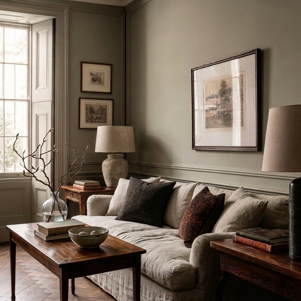
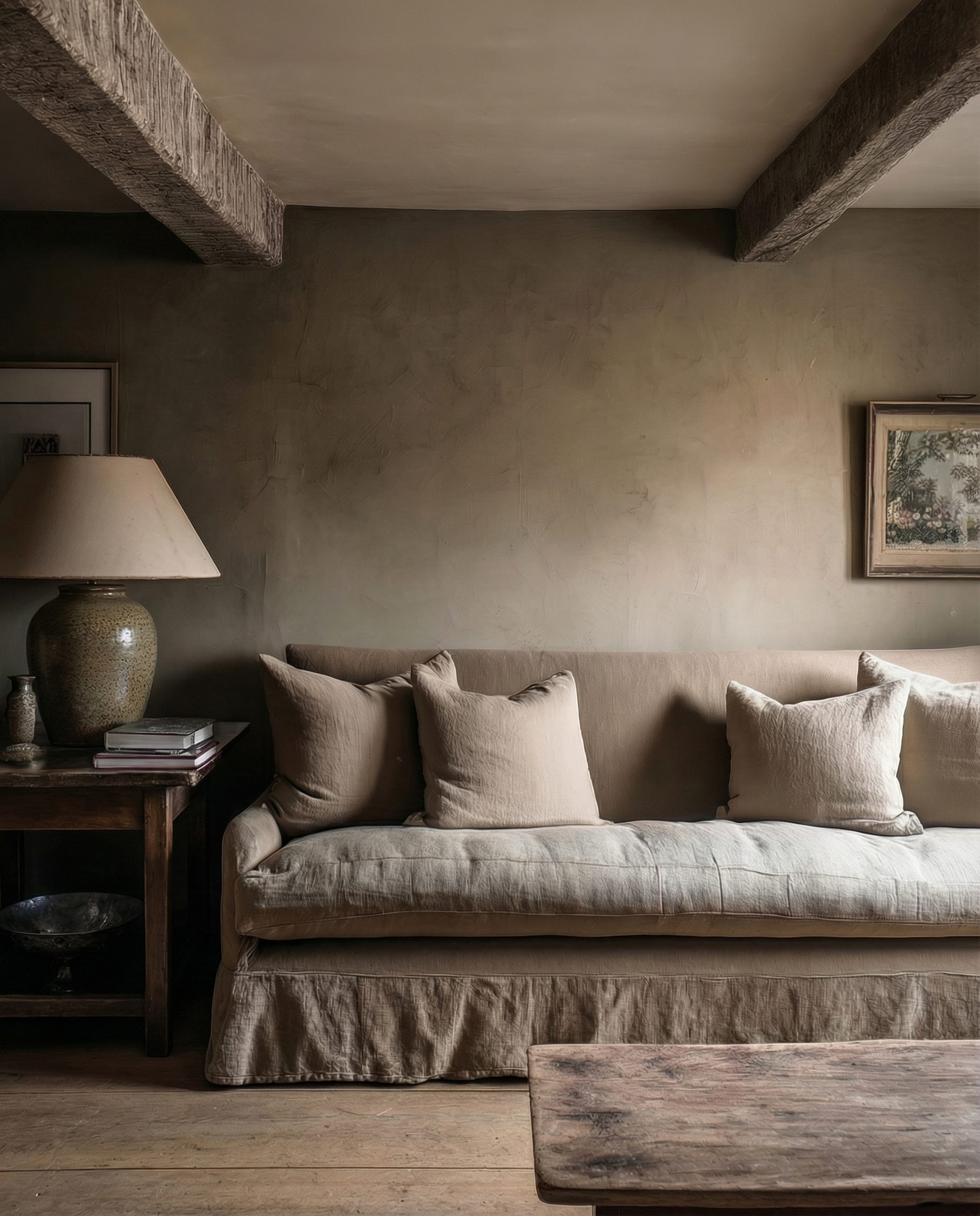
The difference is often simple. A room lit by harsh overhead glare, sound bouncing off hard surfaces, sharp‑edged furniture and echoing, open spans; belongings stored in ways that force constant micro‑decisions. Versus a space shaped by layered lamp light, softened acoustics, rounded sofas, arched thresholds, timber and mineral surfaces, clear circulation and intuitive storage. One heightens vigilance and cognitive load. The other allows the body – and the mind – to exhale.
In this context, restraint is not minimalism. It is care.
Colour shifts from contrast to temperature – from stark oppositions to layered neutrals and deeper, earth‑rooted hues that hold the eye rather than jolt it. Used in the right proportions, inky blues, bottle greens and browned reds read as anchoring rather than overpowering. Texture becomes grounding rather than decorative. Light moves from theatrical to physiological. Layout, storage and sightlines are treated as forms of cognitive off‑loading, reducing background noise for busy and sensitive minds alike.
The goal is not novelty, but regulation.
This also helps explain the renewed pull toward heritage architecture. Not because period homes are inherently “better”, but because many were drawn around the body rather than the camera: thicker walls, deeper reveals, clearer thresholds, a natural rhythm of rooms. When thoughtfully adapted, they offer something increasingly rare in open‑plan, screen‑filled life: spaces that contain you, limit visual noise and give the nervous system a clear sense of where it begins and ends.
Luxury, in this landscape, is no longer loud. It is measured. Considered. Quietly intelligent.
It is also quieter in its sustainability. The more we design bones that can endure – well‑proportioned rooms, robust materials, calm storage – the less often we need to rip things out and start again.
At Reverie, design begins not with a look, but with a feeling – how a room holds you at the end of the day, how light moves through it, how materials age and respond to touch. How clearly a space explains itself to you, even when you are tired or overstimulated.
This is not about predicting the future of interiors.
It is about recognising what the body has been asking for – consistently, quietly – and responding with intention through a more considered, neuroaesthetic approach to interior design.
Colour has slipped back into the home not as spectacle, but as emotional architecture = deepening evenings, clearing mornings and softening the spaces that hold everyday life. This essay looks beyond the 2026 Pinterest palette to ask which colours are truly willing to live with us over time.
For a decade, restraint has set the tone for considered interiors: soft whites, warm earth tones, spaces designed to recede rather than insist. Neutrals did important work, calming the eye while architecture, material and light took the lead. They still do.
Yet beneath this quiet, something has been gathering. The 2026 Pinterest Palette – Persimmon, Cool Blue, Jade, Plum Noir and Wasabi — is being framed as high‑impact colour, saturated enough to cut through both screen and street. But what matters for the home is not their visual volume; it is the emotional work they are being asked to do.
What is emerging now is not a rejection of neutrality, but a more emotionally literate layering over it. Homes are still grounded in brown — timber, leather, clay, tobacco, walnut — yet colour is being reintroduced as punctuation: specific hues placed where the body needs containment, clarity, reassurance or connection. The body needs containment, clarity, reassurance or connection. The question is no longer which colour is trending, but which colour is willing to live with us now.
⸻
Colour as Emotional Architecture
In 2016, colour in the home often floated. Pastels, millennial pinks and optimistic blues sat lightly on bright, white shells, promising progress and ease. A decade on, life feels heavier, more complex. Colour has followed.
Today, the hues rising through platforms like Pinterest carry names loaded with mood: Cool Blue, Jade, Plum Noir, Persimmon, Wasabi. Each is presented as an attitude – serenity, mystery, joy, defiance – yet in the home, their power depends less on personality than behaviour. A colour belongs indoors when it regulates rather than performs; when it helps a room hold its occupants, not just photograph well.
Used this way, colour behaves less like surface and more like architecture. It shapes how space is experienced over hours, days and years: how the nervous system settles on the sofa at night, how the mind clears at first light, how a hallway feels as you cross it for the hundredth time.
⸻
Not Every Colour Wants to Live With Us
Not every colour that captures attention endures in a home.
Wasabi is a useful example here precisely because it exposes the difference between cultural visibility and domestic endurance. An electric chartreuse gaining ground across beauty, streetwear and event styling, it is tuned to the speed of visual culture. It thrives on contrast, spotlight, the quick hit of the scroll – a colour that may be thrilling to wear but rarely wants to settle on a wall.
Domestic space asks for something different. Colours that endure at home tend to share a quieter profile: they steady rather than spike, soften rather than shout, deepen rather than distract. They are chosen for the way they feel when experienced repeatedly and peripherally, not for the impact of a single image.
The emerging distinction is between colours that perform culturally and colours that support life. The Pinterest Palette captures both — hues built for visibility and hues that support dwelling.
⸻
Plum Noir – Depth, Evening, Containment
Among the five, Plum Noir translates most naturally into interiors. Described as dark and decadent and tied to ideas of main‑character energy, it absorbs light instead of reflecting it. In rooms, this reduction of visual noise is exactly where its strength lies.
Used on walls, upholstery or cabinetry, these deep plum tones draw the edges of a space inward, creating enclosure in homes that have spent years chasing openness and brightness. They are particularly at home in evening rooms — dining spaces, libraries, snug sitting rooms – where conversation lengthens and the day loosens its grip.
Paired with brown woods, aged metals and low, layered light, Plum Noir ceases to feel theatrical and instead becomes containing. It allows a room to recede into atmosphere rather than posture as a backdrop. Plum is not a colour for display; it is a colour for being held.
⸻
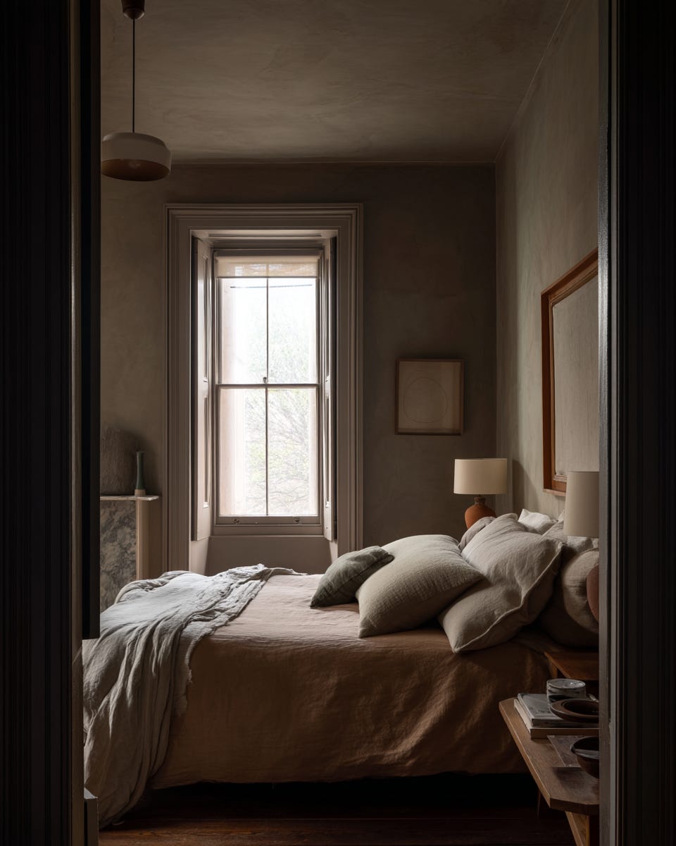
Cool Blue – Clarity, Reset, Breath
If Plum Noir works through depth, Cool Blue operates through clarity. Pinterest connects this hue to mental resets, and a craving for clean focus in an overstimulated world. Unlike the sugary pastels of the last decade, this blue is mineral, chalked, almost weightless.
In the home, Cool Blue belongs where the mind needs to soften its edges: bathrooms at first light, studies, dressing spaces, quiet bedrooms. It does not warm a room; it clears it. Used alongside warm browns and natural textures, it introduces air without chill – a visual deep breath rather than a high‑contrast statement.
In an era of constant input, this sort of clarity has become quietly essential. It is not about escapism, but about the everyday relief of a room that asks less of you the moment you enter.
⸻
Jade – Grounding, Soft Authority, Reassurance
Jade is being framed as quiet luxury’s favourite green. It sits somewhere between celadon and moss, behaving almost like a new neutral. Crucially, it is not the botanical green of houseplant maximalism, nor the sage that saturated the last wave of interior trends. It is cooler, stone‑softened, more architectural than decorative.
These mineral greens sit comfortably against brown – oak, walnut, leather, suede – grounding a space without darkening it. They lend a calm, grown‑up presence to kitchens, headboards or the single armchair where the day reliably slows.
Emotionally, Jade does not dazzle. It reassures. It offers a kind of soft authority, steadying a room so that other elements – books, textiles, the messiness of life – can express themselves without tipping into chaos.
⸻
Persimmon – Warmth, Memory, Human Presence
Persimmon, described as a sunset‑soaked blend of red and orange that radiates joy and nostalgia, has been gaining momentum in searches for orange suits, colour combinations and aesthetic references. It is a colour of contact zones – parties, lipstick, lacquered nails, saturated photographs.
In the home, its sharpest iterations can easily overpower. The version that truly lives with us is softened – closer to rust, clay and sun‑warmed fruit than to neon sportswear. Used as a lampshade, a piece of art, a glazed ceramic or the surprise lining of a curtain caught in evening light, Persimmon becomes connective rather than loud.
Set against brown, it echoes skin, terracotta, worn leather. Instead of shouting for attention, it gently humanises spaces that risk feeling austere, introducing warmth without weight and nostalgia without pastiche.
⸻
Why Now? 2016, 2026 and the Weight of Colour
The current palette cannot be separated from the culture that produced it. Ten years ago, interiors leaned into optimistic minimalism: marble‑splashed benchtops, rose‑gold accents, greenery in every corner and a spectrum of millennial pinks and greens promising a better, lighter future. Colour acted as a buoyant overlay, a promise that things were moving forward.
Today’s conditions are different. Pinterest’s data‑driven forecast arises from billions of saves and searches at a time when people are using colour not only to signal taste but to manage mood. The dominant neutral of 2026 – warm white framed as a refuge from a noisy world — mirrors that shift, offering calm rather than optimism.
Against that quieter base, the new hues carry more weight. They sit closer to the body – in nails, knitwear, beauty looks – before entering the home. They are less about novelty and more about modulation: deepening evenings, clarifying mornings, grounding daily rituals, warming points of contact. The question has shifted from what’s in to what supports the way we actually live now.
⸻
From Quiet Luxury to Precise Care
Quiet luxury has been declared over as often as it has been named, yet what is unfolding is not an ending but a refinement. The future is less about absence – blank, beige anonymity – and more about intention: knowing where depth belongs, where lightness is needed, where warmth should gather and where a room ought to simply recede.
For most homes, that will mean a light, soft base anchored by warmth – ivory, stone and pale neutrals grounded by timber, leather and clay – with colour reserved for the places where the day actually touches the room: the table edge, the reading chair, the view. Colour, used in this way, disappears into feeling. It becomes a form of care rather than spectacle: the plum cocoon that makes a winter evening bearable; the blue‑washed bathroom that clears the mind; the jade kitchen that hums along with the rhythm of everyday life; the persimmon flash that reminds a restrained space it is still inhabited by people.
The most enduring homes of this next decade will not be those that chase each palette as it drops, nor those that cling rigidly to neutrality. They will be the ones that treat colour as emotional architecture – not everywhere, but exactly where it matters.