How Interiors Are Quietly Recalibrating in 2026
Reading familiar forms through a deeper lens

Much of what is shaping interiors now is not new. Curved seating, earthy palettes, tactility, softness, and a return to proportion have surfaced repeatedly over the last decade – often first in European interiors, hospitality spaces, and fashion‑led environments before filtering into the residential mainstream. Designers have long understood their appeal.
What feels different now is not what we are seeing, but why these ideas have endured – and why they are coming together so clearly at this moment.
From rustic modern rooms and lived‑in luxury to sculptural lighting, refined maximalism and a renewed interest in softer, more tempered materials, the looks being labelled “trends” for 2026 are all expressions of the same underlying shift: homes designed to regulate, not perform.
When ideas return again and again – evolving rather than disappearing – they stop being trends.
They become structural.
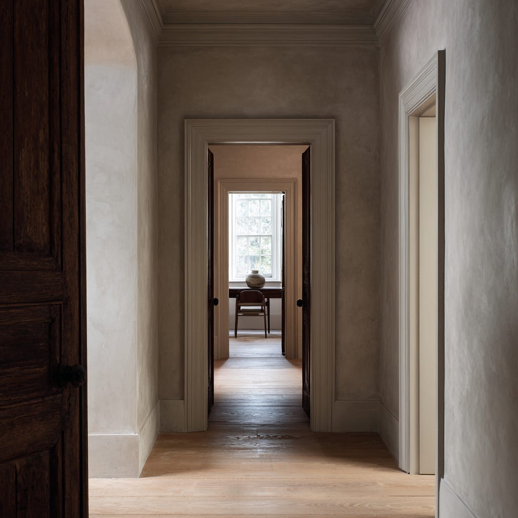
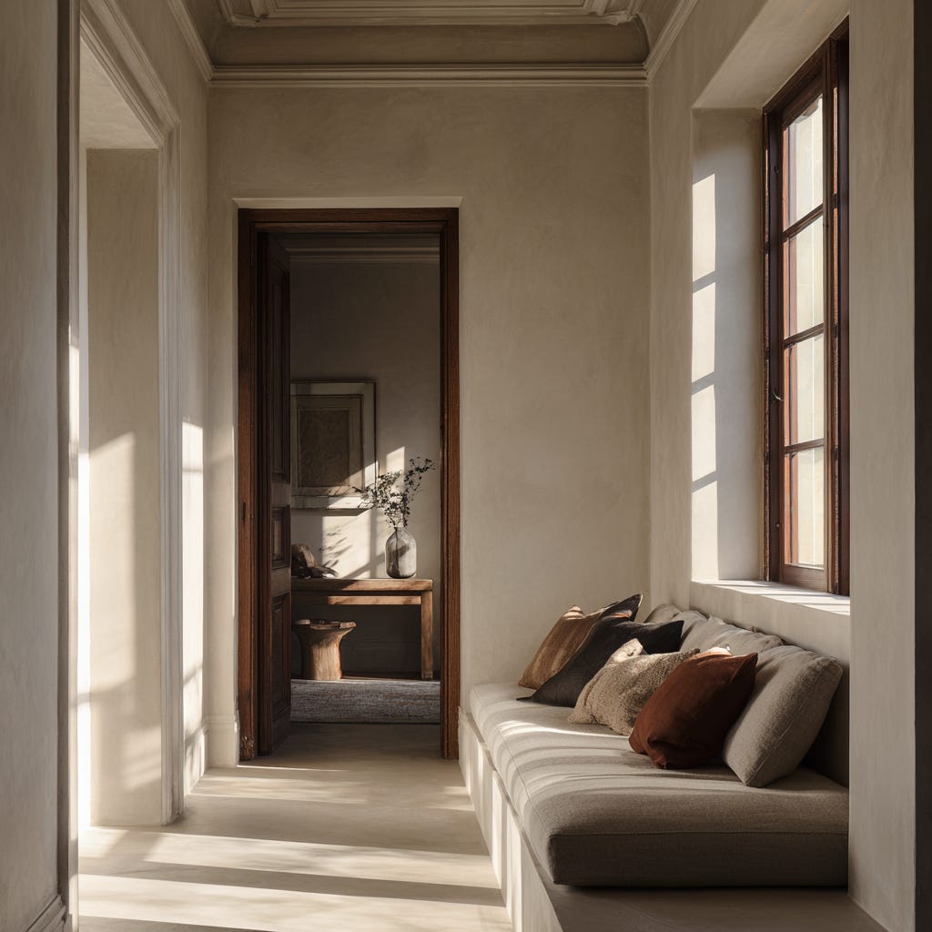
“Thresholds and proportion doing the work before decoration.”
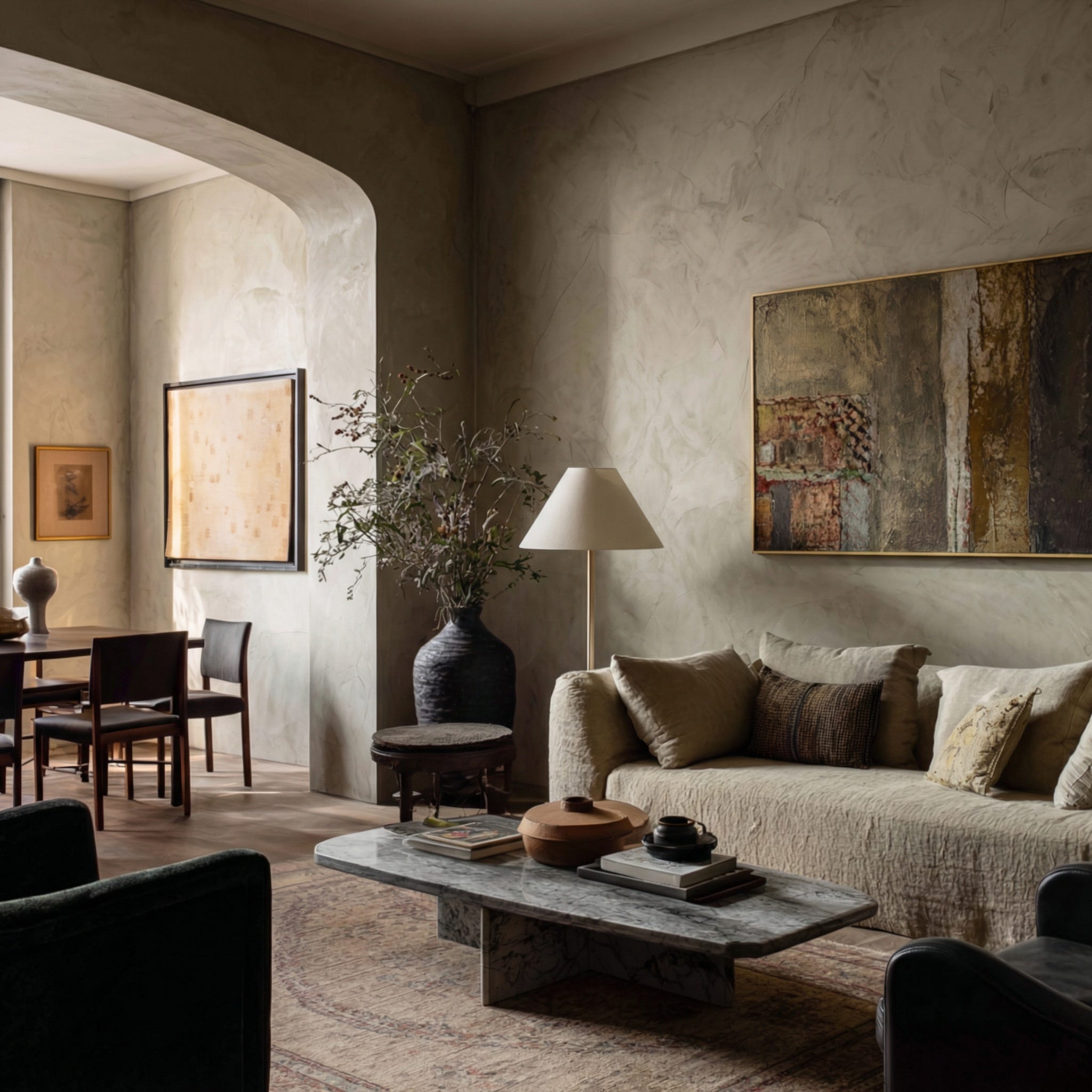
Depth, warmth and mineral restraint
These tones are not new: soft clays, limestone whites, chalked neutrals, muted ochres and tobacco shades have circulated through European interiors for years. What has changed is not their presence, but the intention behind their use.
Chosen now for their weight and temperature rather than their novelty, these colours absorb light gently, soften contrast and reduce visual friction. They steady a space. The body reads them as calm, grounded and reassuring.
Deeper shades in this spectrum – inky blues, aubergines, espresso browns and earthy olives – are emerging as anchoring colours for 2026, used to wrap rooms in a sense of depth rather than to shout for attention. Within that, inky and mineral blues are adding a quiet clarity to the palette, bringing a sense of freshness without visual sharpness.
When paired with natural materials, these hues behave less like feature colours and more like refined neutrals – calm enough to live with for years, yet exact enough to lift a room emotionally. This is colour used to stabilise rather than stimulate – particularly relevant in homes where attention is already stretched, whether through demanding work, constant digital input, or heightened sensory awareness.
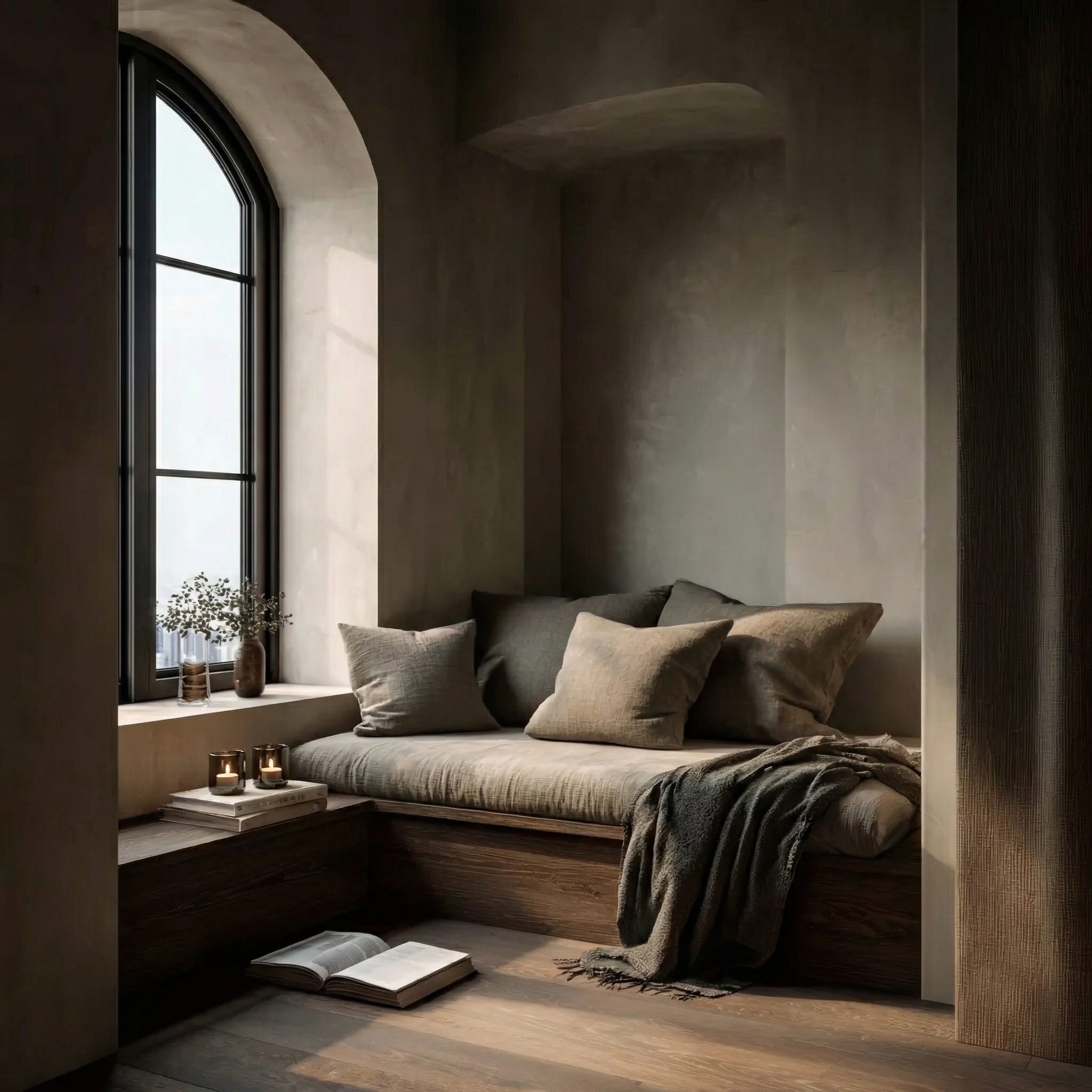
Curves, containment and softened geometry
Rounded sofas. Barrel‑back chairs. Arched thresholds. Bull‑nosed edges.
Curves are not a revival; they are a response. Sharp geometry keeps the body alert. Enclosing forms soften transitions and create a sense of containment.
In a culture shaped by constant input, this gentler geometry offers relief. It allows the body to settle rather than brace – supporting somatic calm for both neurotypical and neurodivergent occupants.
Lighting designed around rhythm, not drama
Layered lamps. Shaded pendants. Pools of light.
Lighting has long been discussed aesthetically. It is now being understood biologically. Harsh overhead glare disrupts rhythm and rest; layered light supports transition, focus and recovery.
The most compelling interiors feel good at 8am and at 8pm – not because they impress, but because they support. They offer gradations of brightness that different nervous systems can adjust to rather than endure.
Texture, tactility and acoustic softness
Textiles, rugs, heavier curtains, layered upholstery.
Texture has moved beyond decoration. Soft materials calm the auditory environment as much as the visual one – absorbing sound, reducing echo, and creating spaces that feel quieter, slower and more humane.
This is why rooms are increasingly cocooning rather than sparse. For people who find noise and reverberation particularly draining, these choices are not indulgence; they are access.
A refined relationship with maximalism
Pattern, colour, memory and richness – held with intention.
Maximalism was not a detour. It was a necessary phase of emotional expression: a reclaiming of identity and joy during a period of instability. What we are seeing now is not its rejection, but its refinement.
Richness is being held within structure. Expression is supported by calm. Visual stories are still being told – but with more attention to sightlines, resting points for the eye, and how much information a room asks the brain to process at once.
Softer materials and tempered shine
Pewter, brushed metals, aged brass, mixed finishes.
Highly polished, celebratory surfaces are giving way to materials with gentler reflectivity. This shift is less about fashion cycles and more about sensory response. A softened sheen registers as calmer than a sharp gleam.
This move toward tempered materials reflects a wider desire for environments that feel steady rather than stimulating – surfaces that catch the light quietly, rather than demand attention.
Heritage and proportion – not nostalgia
Rhythm. Symmetry. Human scale.
The renewed interest in heritage is not about looking backwards. It is about legibility. Proportion creates order – and order, in uncertain times, feels like safety.
Clear thresholds, generous reveals, balanced rooms and readable axes reduce cognitive effort. They make a home easier to navigate – physically and mentally – for everyone who lives there.
Many older houses also tend to use depth of wall, window reveals and solid doors to modulate light and sound. When these are sensitively retained, they become built‑in regulating tools – helping to temper brightness, echo and temperature before any decorative layer is added.
When the bones are right, atmosphere does not have to work as hard. Quiet colour, patina and soft furnishings can sit on top of a structure that already feels composed, rather than trying to correct a plan that never quite settles.
The home as habitat
Thresholds. Shade. Planting. Outdoor rooms.
As climate patterns shift, the boundary between inside and outside is being rethought. Exterior space is becoming part of the home’s regulating system – offering airflow, seasonal rhythm and sensory relief.
Pergolas, deep thresholds, planted courtyards and sheltered terraces are no longer lifestyle gestures. They are functional responses to heat, light, and how bodies move through the day.
Longevity, freshness and discernment
None of this suggests interiors should be cautious or devoid of personality. On the contrary – homes still benefit from moments of colour, pattern, surprise and expression.
What defines 2026 is not restraint alone, but discernment.
Enduring architectural decisions – layout, proportion, doors, flooring, core upholstery – are increasingly designed for longevity and regulation. Expressive layers – paint, wallpaper, textiles, lighting and art – are where freshness and cultural energy are allowed to play.
In other words:
the framework regulates; the layers can react.
This distinction is aesthetic, neurological and ecological. The more the framework is designed to endure and hold, the less often they need to be replaced – reducing both cognitive upheaval and material waste.
A recalibration, not a trend
At Reverie, this layered approach is central to how we work.
Not designing to impress at first glance – but to support how a space is lived in over time.
The details will change.
The colours will shift.
But the underlying direction is clear.
Design is becoming less about display – and more about how it feels to be held by a space. Seen through this lens, 2026 feels less like a moment of fashion and more like a collective recalibration toward calmer, more grounded homes.
These are not theoretical ideas – they show up in the texture of everyday life, in how a room supports you on ordinary mornings as much as on special occasions. If you’ve been sensing this shift in your own home, I hope these thoughts give you language for what you’ve been noticing.
More reflections to come.
With thanks,
Kate