As we move into 2026, homes are being asked to do something more than perform. Increasingly, neuroaesthetic interior design is shaping how spaces support calm, clarity and regulation.
For years, homes were designed to impress, to photograph well, to signal taste. Increasingly, they are being asked to regulate. To soften the nervous system, reduce visual tension, and support how we actually live.
This is not a new aesthetic.
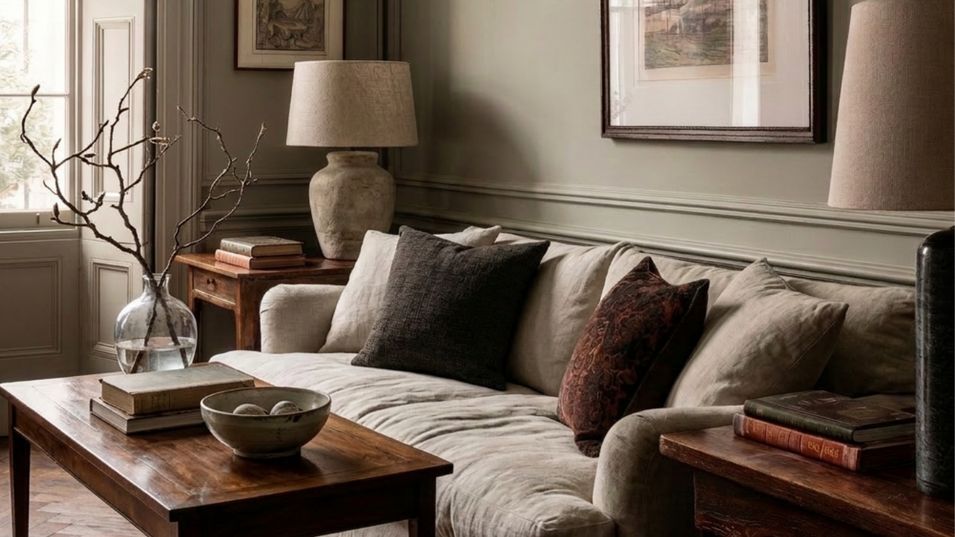
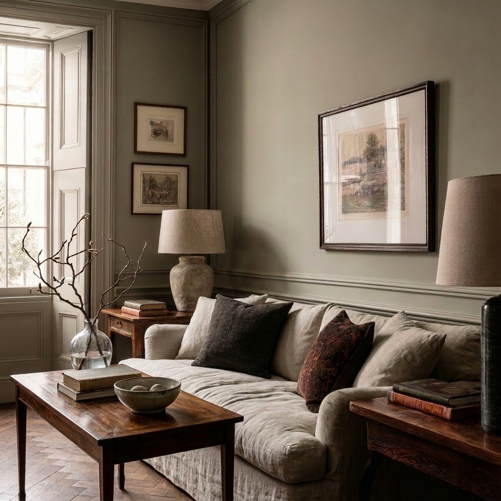
Curved furniture, earthy and mineral palettes – plaster, stone, chalked neutrals and warm timber – tactility and softness have surfaced repeatedly over the last decade, especially in boutique hotels and European interiors, before becoming part of everyday language in the home. Many designers have been working with these ideas instinctively for years.
What has changed is not their appearance, but their persistence – and the clarity with which we now understand why they matter.
Prolonged digital intensity, environmental uncertainty, and accelerated pace have reshaped what we need from home. Stimulation, once read as excitement, increasingly registers as fatigue. Calm is no longer an absence of design; it is a function of it.
Neuroaesthetic interior design and the nervous system
This is where neuroaesthetics enters the conversation – not as a trend, but as a framework. Light, proportion, material, colour and sound all register in the body. Design can either keep us alert or allow us to settle. This is the foundation of neuroaesthetic interior design – not as a style, but as a way of understanding how spaces are felt.
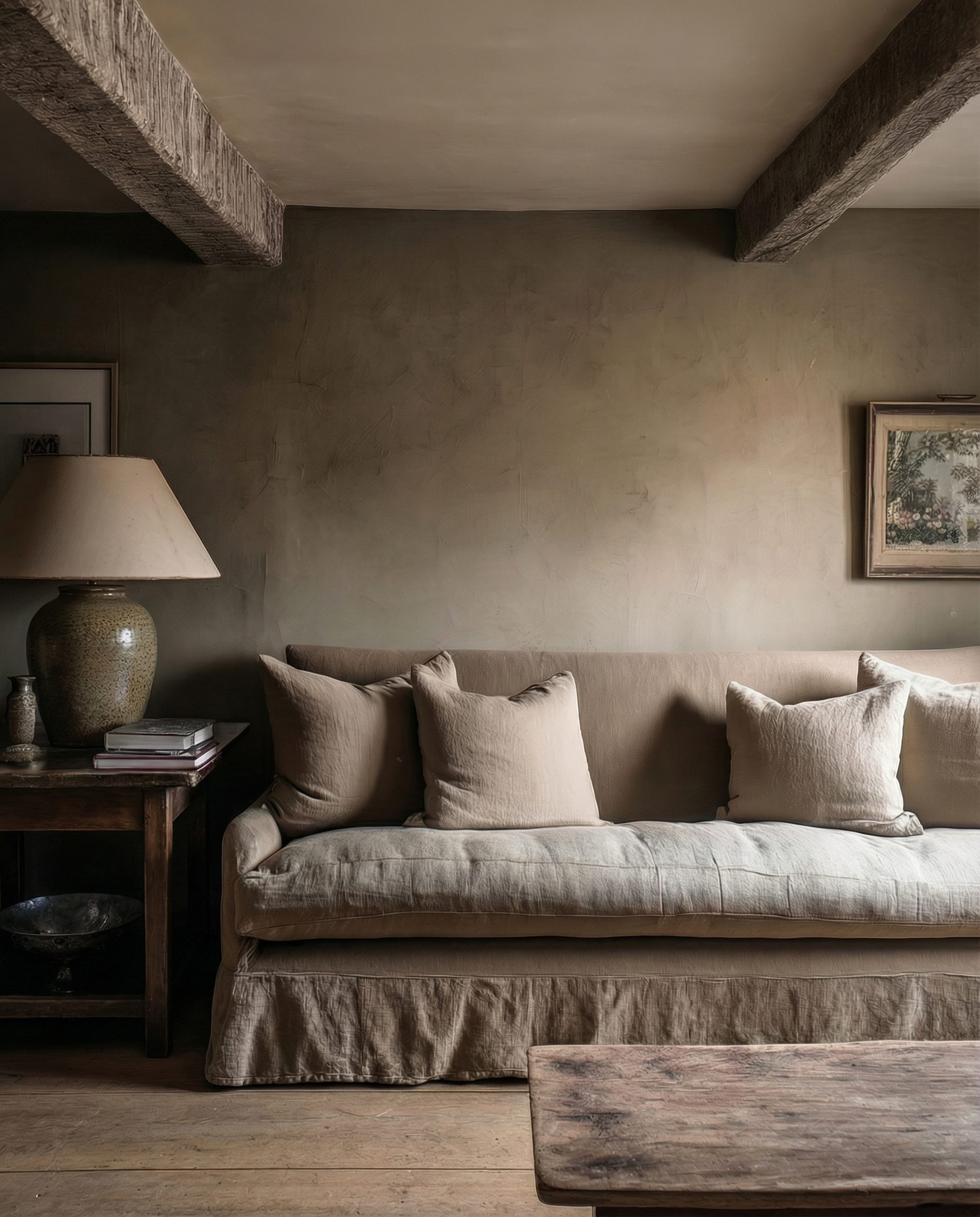
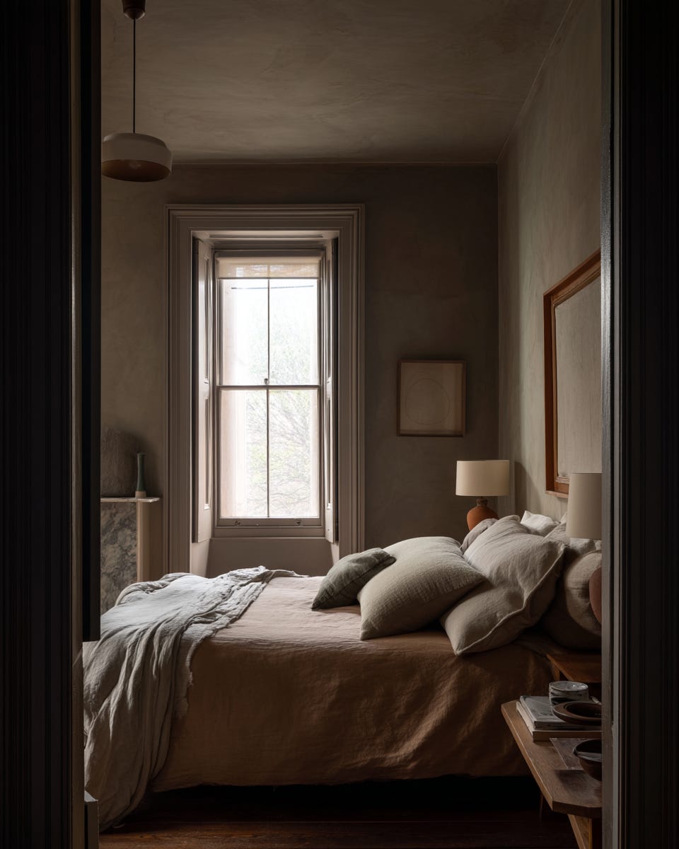
The difference is often simple. A room lit by harsh overhead glare, sound bouncing off hard surfaces, sharp‑edged furniture and echoing, open spans; belongings stored in ways that force constant micro‑decisions. Versus a space shaped by layered lamp light, softened acoustics, rounded sofas, arched thresholds, timber and mineral surfaces, clear circulation and intuitive storage. One heightens vigilance and cognitive load. The other allows the body – and the mind – to exhale.
In this context, restraint is not minimalism. It is care.
Colour shifts from contrast to temperature – from stark oppositions to layered neutrals and deeper, earth‑rooted hues that hold the eye rather than jolt it. Used in the right proportions, inky blues, bottle greens and browned reds read as anchoring rather than overpowering. Texture becomes grounding rather than decorative. Light moves from theatrical to physiological. Layout, storage and sightlines are treated as forms of cognitive off‑loading, reducing background noise for busy and sensitive minds alike.
The goal is not novelty, but regulation.
This also helps explain the renewed pull toward heritage architecture. Not because period homes are inherently “better”, but because many were drawn around the body rather than the camera: thicker walls, deeper reveals, clearer thresholds, a natural rhythm of rooms. When thoughtfully adapted, they offer something increasingly rare in open‑plan, screen‑filled life: spaces that contain you, limit visual noise and give the nervous system a clear sense of where it begins and ends.
Luxury, in this landscape, is no longer loud. It is measured. Considered. Quietly intelligent.
It is also quieter in its sustainability. The more we design bones that can endure – well‑proportioned rooms, robust materials, calm storage – the less often we need to rip things out and start again.
At Reverie, design begins not with a look, but with a feeling – how a room holds you at the end of the day, how light moves through it, how materials age and respond to touch. How clearly a space explains itself to you, even when you are tired or overstimulated.
This is not about predicting the future of interiors.
It is about recognising what the body has been asking for – consistently, quietly – and responding with intention through a more considered, neuroaesthetic approach to interior design.
Kate
Reverie